27 Transformative Interior Paint Colors That Instantly Elevate Your Home
The right paint color transforms an ordinary room into an extraordinary space.
Beyond just decoration, your wall color sets the mood, affects your energy, and creates the backdrop for everything else in your home.
Choosing from thousands of paint options can feel overwhelming, but certain colors consistently deliver stunning results across different lighting conditions and design styles.
These versatile hues work beautifully in various rooms while complementing most furniture and decor.
Ready to refresh your space?
These 27 designer-approved interior paint colors offer the perfect blend of timeless appeal and contemporary style to ensure your walls look fantastic for years to come.
1: Simply White (Benjamin Moore)
Create an airy, expansive feeling with this luminous warm white.
Simply White brightens any space without the harsh, clinical feel of pure white.
The subtle yellow undertones add a welcoming glow that works beautifully in both modern and traditional settings.
This versatile color serves as the perfect backdrop for colorful art and furnishings.
Use it throughout your home for a cohesive look that still allows each room to express its unique personality through accessories.
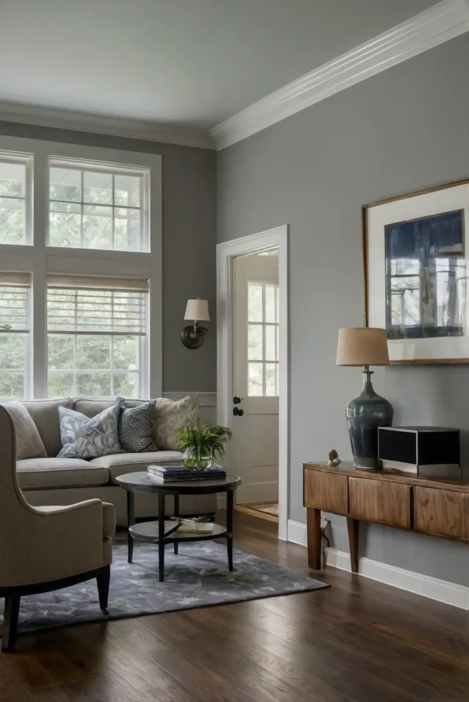
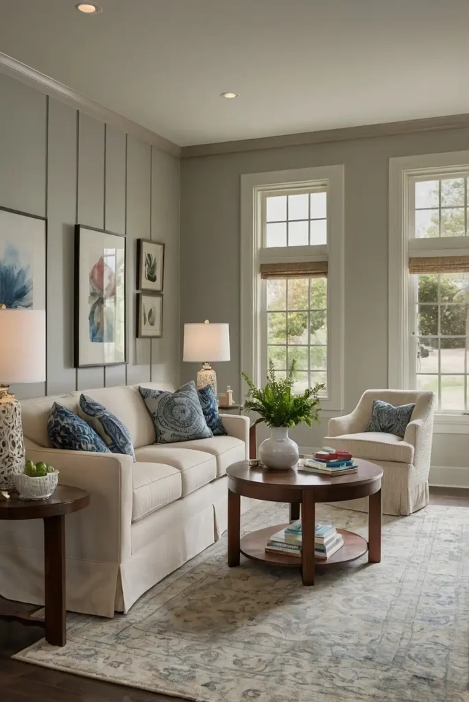
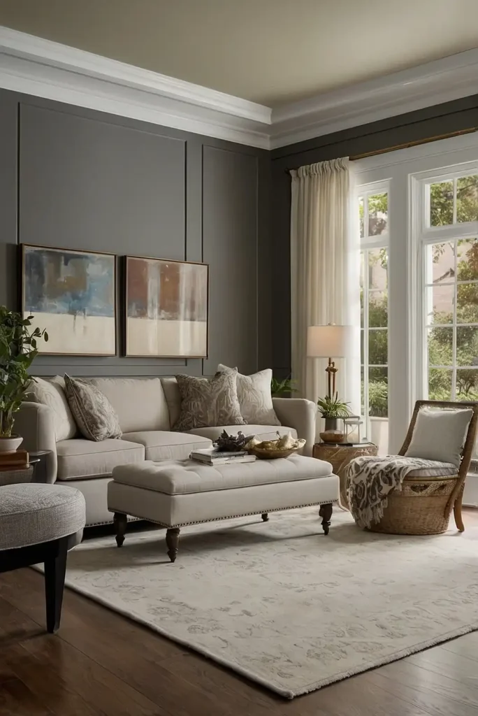
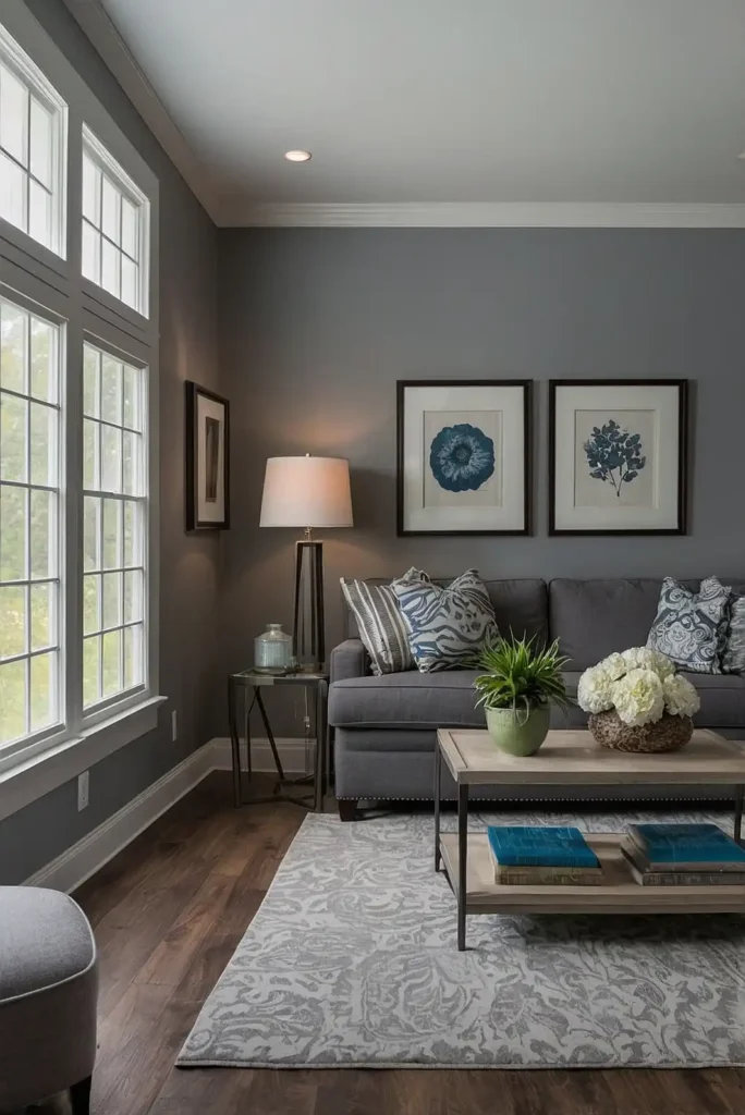
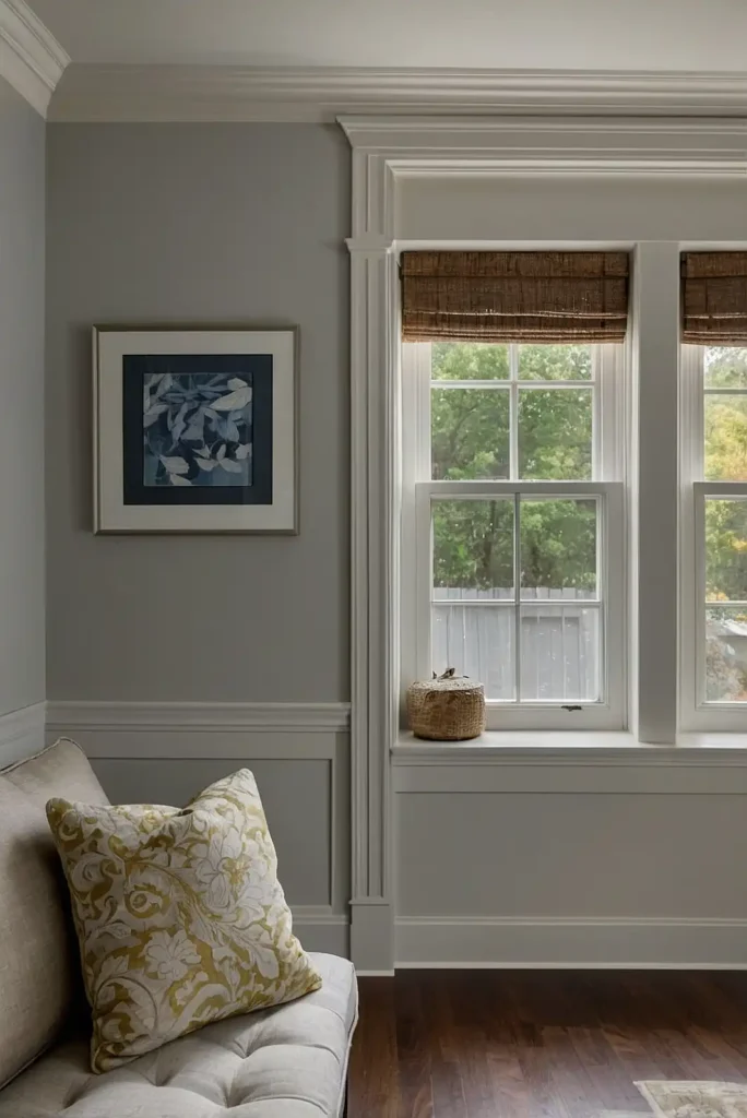
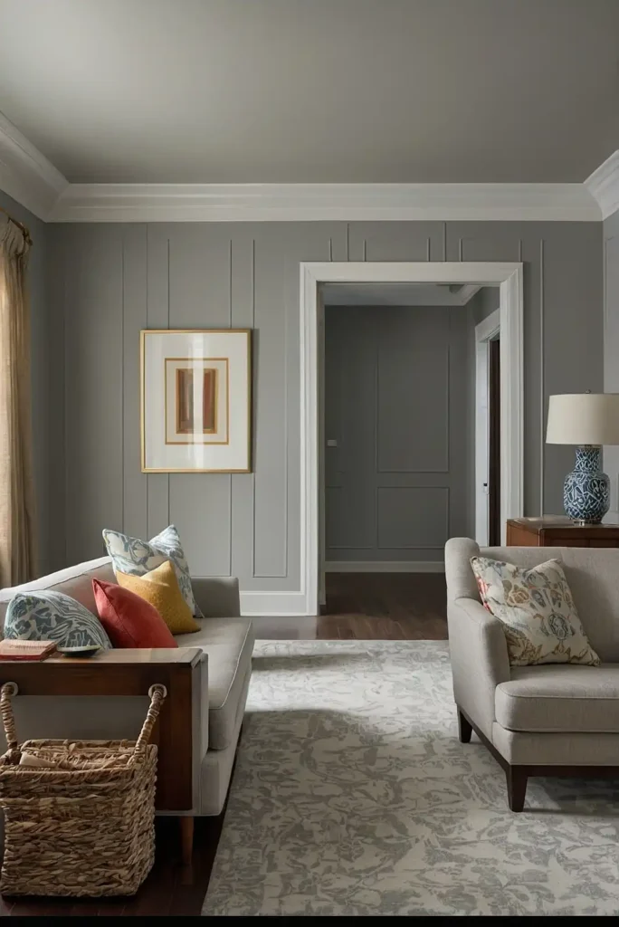
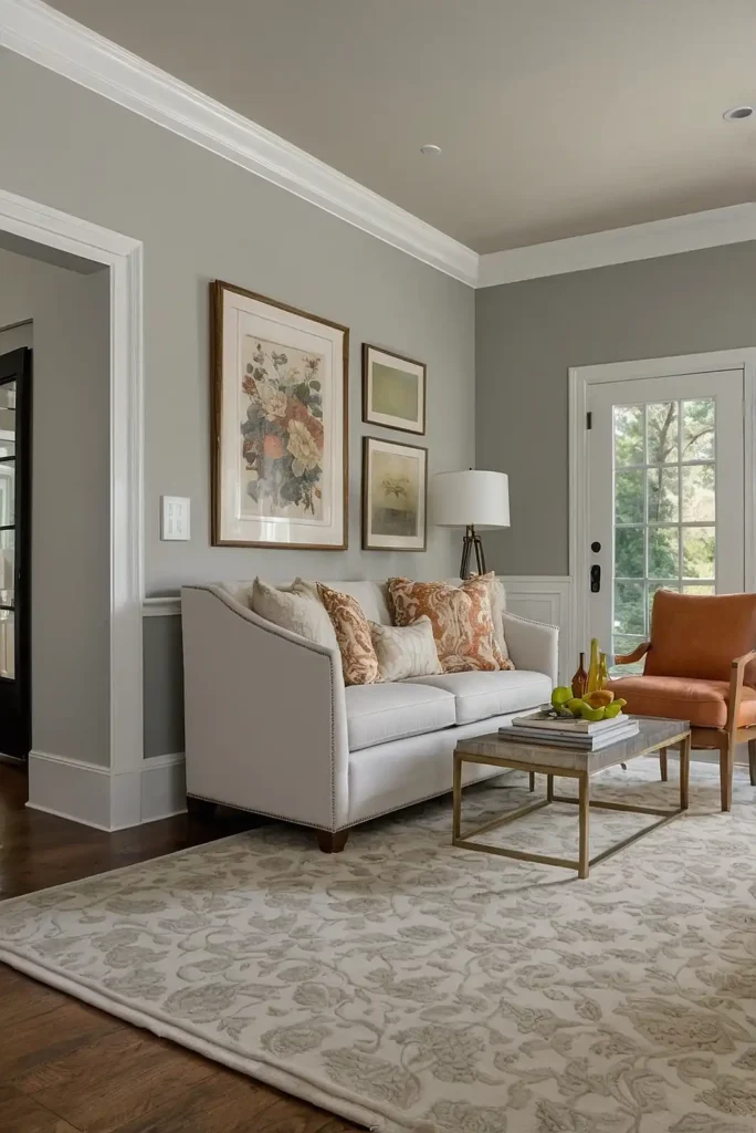
2: Agreeable Gray (Sherwin-Williams)
Transform your space with this perfectly balanced greige that adapts to different lighting conditions.
Agreeable Gray lives up to its name by playing nicely with virtually any decor style or color palette.
The subtle blend of gray and beige creates a sophisticated neutral backdrop.
This chameleon-like color appears warmer in south-facing rooms and cooler in north-facing spaces.
Its versatility makes it ideal for open-concept homes where you need color flow between rooms.
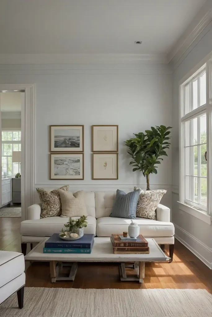
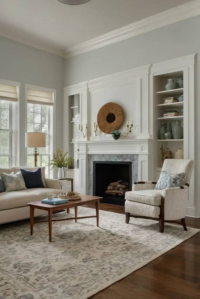
3: Pale Oak (Benjamin Moore)
Infuse your rooms with subtle warmth using this delicate, sophisticated neutral.
Pale Oak creates a soft, atmospheric quality that makes spaces feel larger and more serene. The gentle beige undertones provide warmth without skewing yellow or pink.
This refined color works beautifully with both cool and warm accent colors.
Use it in bedrooms and living spaces where you want a calming backdrop that still has more character than basic white.
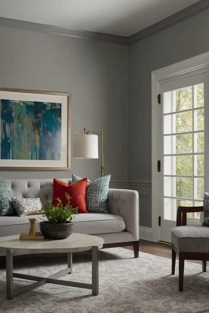
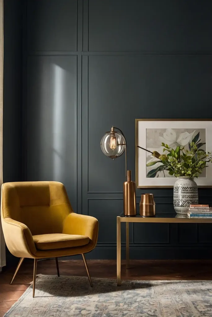
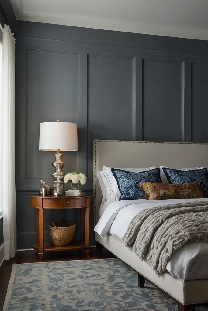
4: Hale Navy (Benjamin Moore)
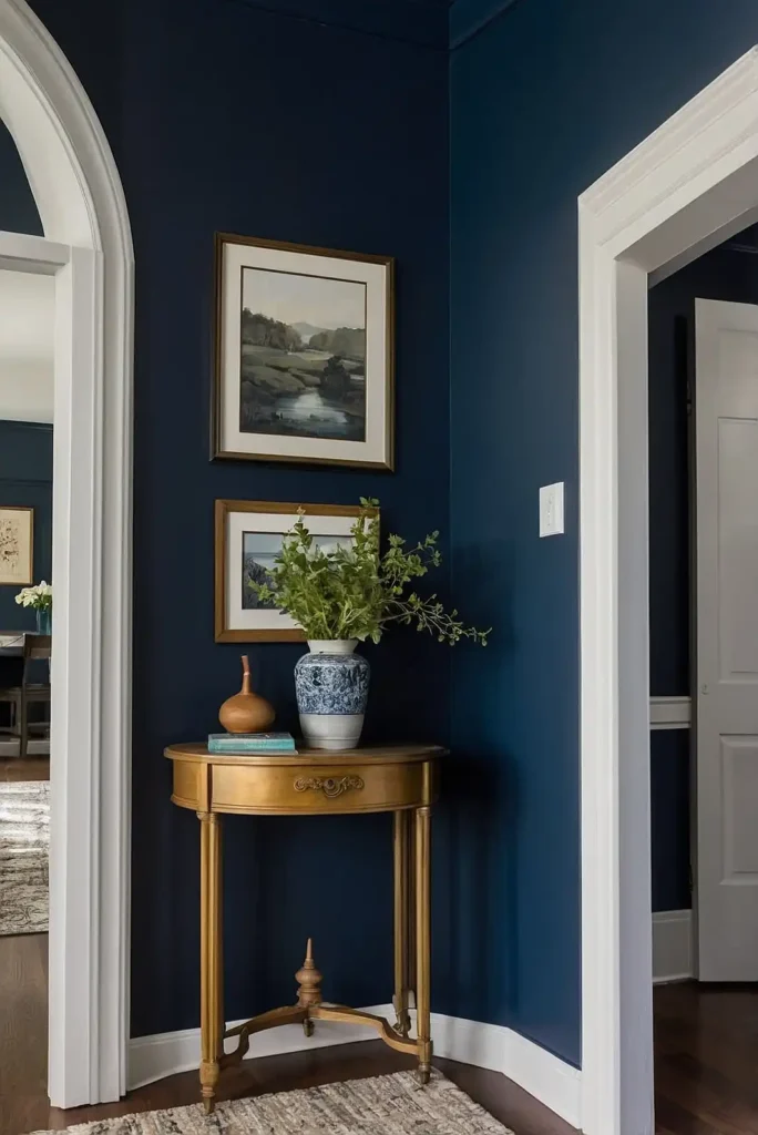
Add dramatic sophistication with this deep, rich navy that functions as a neutral.
Hale Navy creates instant architectural interest, especially in dining rooms, offices, or powder rooms.
The balanced blue undertones prevent it from appearing too cold or purple.
This versatile dark color pairs beautifully with brass fixtures and natural wood tones.
Consider using it on an accent wall if you’re hesitant to commit to a fully dark room.
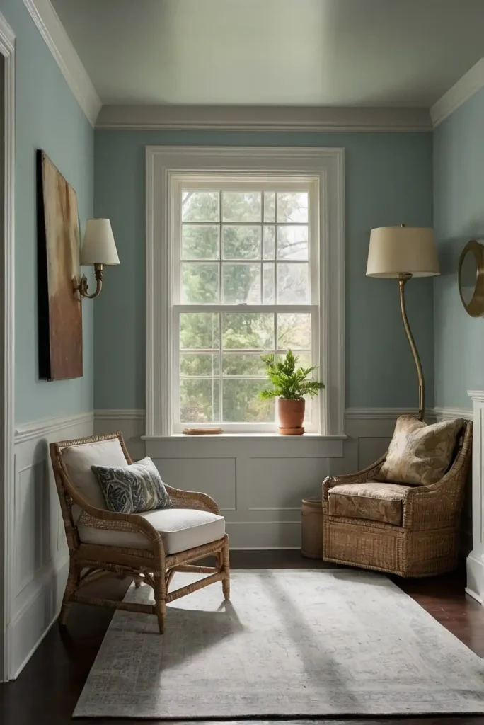
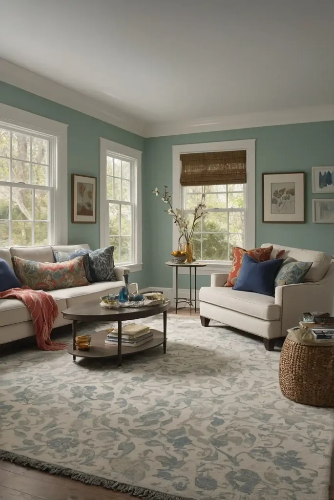
5: Sea Salt (Sherwin-Williams)
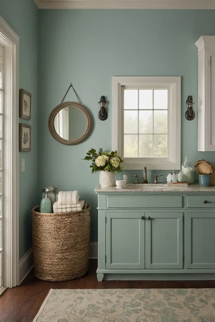
Create a tranquil spa-like atmosphere with this soothing blue-green-gray.
Sea Salt adapts beautifully to different lighting conditions, appearing more blue, green, or gray depending on the time of day.
The color evokes a coastal feeling without being overtly beachy.
This versatile shade works especially well in bathrooms, bedrooms, and sunrooms.
Pair it with white trim and natural materials for a fresh, organic look that never feels dated.
6: Accessible Beige (Sherwin-Williams)
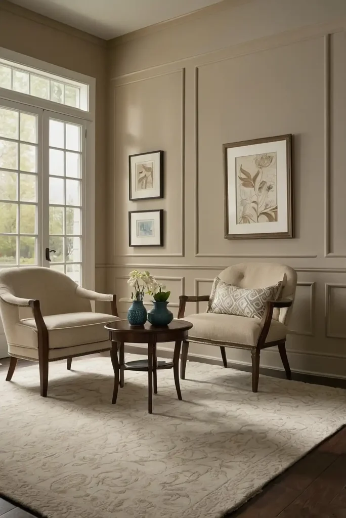
Transform your home with this balanced neutral that bridges the gap between beige and gray.
Accessible Beige offers enough warmth to feel inviting without the yellow undertones that can make some beiges feel dated.
The subtle gray influence gives it a contemporary edge.
This versatile color works beautifully in both north and south-facing rooms. Use it throughout your home for a cohesive look that adapts well to different lighting conditions and decor styles.
7: Classic Gray (Benjamin Moore)
Brighten your space with this barely-there gray that offers an alternative to white.
Classic Gray provides enough color to create interest while maximizing light reflection.
The subtle warm undertones prevent it from feeling cold or sterile.
This sophisticated neutral pairs beautifully with both cool and warm accent colors.
Use it in spaces where you want a light, airy feeling without the starkness of white.
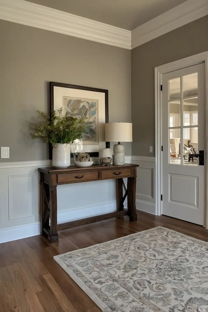
8: Revere Pewter (Benjamin Moore)
Choose this legendary greige for its remarkable ability to complement both warm and cool accents.
Revere Pewter creates a sophisticated backdrop that enhances architectural details while providing enough color to add character to your walls.
The balanced undertones prevent it from appearing too cold or too warm.
Use this versatile shade in living spaces, hallways, and bedrooms for a timeless look that works with various design styles.
9: Alabaster (Sherwin-Williams)
Transform your home with this luminous off-white that creates an airy, peaceful atmosphere.
Alabaster offers just enough warmth to prevent it from feeling stark while maintaining a clean, fresh appearance.
The soft, creamy quality makes it ideal for brightening dark spaces.
This versatile color works beautifully on trim, ceilings, and cabinetry as well as walls.
Use it throughout your home for a cohesive envelope that adapts well to different lighting conditions.
10: Repose Gray (Sherwin-Williams)
Create a contemporary look with this versatile cool gray that doesn’t feel cold or clinical.
Repose Gray offers enough depth to create interest while remaining light enough to serve as a whole-house color. The subtle blue undertones add a refreshing quality.
This adaptable shade pairs beautifully with white trim and warm wood tones.
Use it in living spaces and bedrooms where you want a sophisticated neutral backdrop for your furnishings.
11: Swiss Coffee (Benjamin Moore)
Infuse your home with warmth using this creamy off-white that creates a cozy, inviting atmosphere.
Swiss Coffee offers just enough color to prevent walls from feeling stark while remaining light enough to maximize your space. The subtle yellow undertones create a soft glow.
This timeless color works beautifully in both traditional and contemporary homes.
Use it throughout your space for a consistent, bright backdrop that still feels warm and welcoming.
12: Collingwood (Benjamin Moore)
Transform your walls with this elegant greige that adapts to different lighting conditions.
Collingwood creates a sophisticated backdrop that enhances rather than competes with your furnishings.
The balanced undertones prevent it from feeling too cool or too warm.
This versatile color shifts throughout the day with changing light. Use it in living rooms, dining rooms, and bedrooms for a refined neutral that complements various design styles.
13: Mindful Gray (Sherwin-Williams)
Add depth to your walls with this medium-toned warm gray that creates a cozy, embracing atmosphere.
Mindful Gray offers enough color to create interest without overwhelming your space. The subtle warm undertones prevent it from feeling cold or sterile.
This adaptable shade provides a sophisticated backdrop for various design styles.
Use it in spaces where you want a bit more drama than lighter neutrals provide without going too dark.
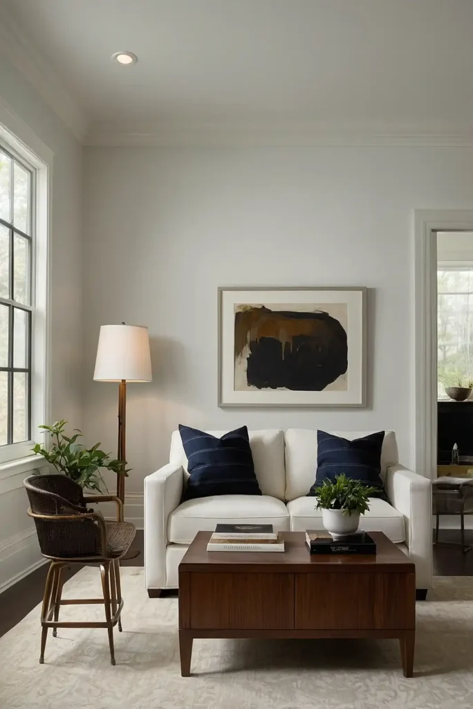
14: Benjamin Moore White Dove
Brighten your home with this luminous soft white that creates an airy, peaceful atmosphere.
White Dove offers just enough warmth to prevent it from feeling stark while maintaining a clean, fresh appearance. The subtle creamy undertones prevent a cold, clinical look.
This versatile color works beautifully on walls, trim, and cabinetry.
Use it throughout your home for a cohesive look that brightens your space while maintaining a soft, welcoming quality.
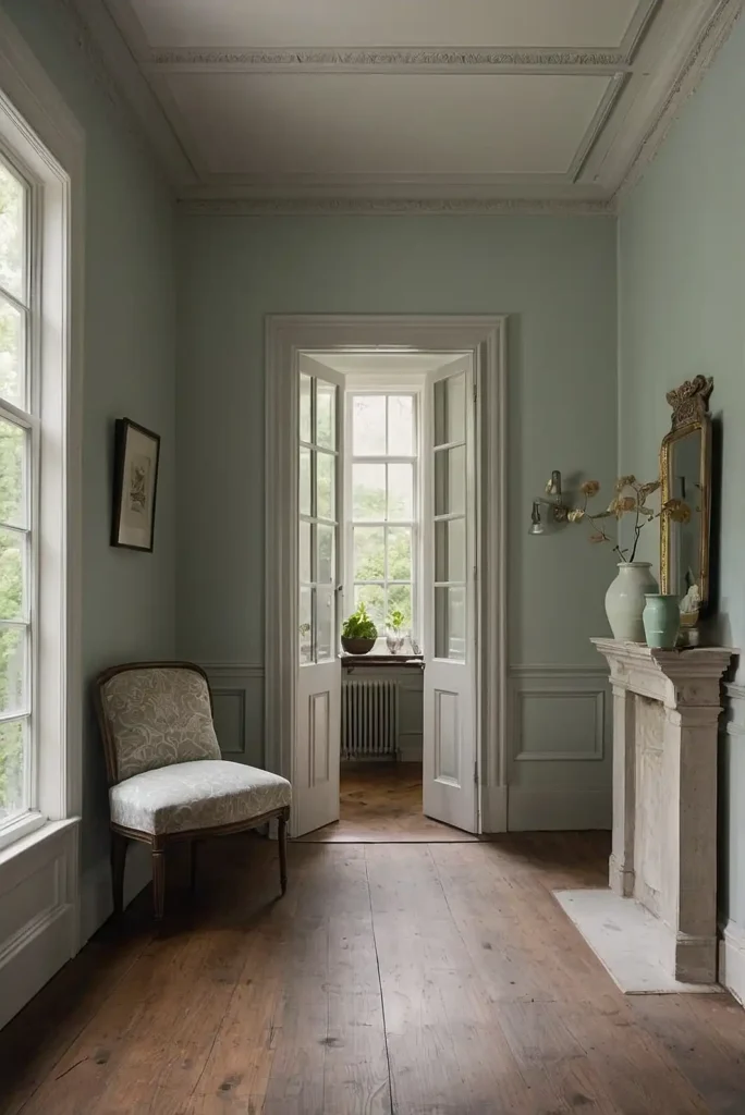
15: Pale Smoke (Benjamin Moore)
Create a tranquil atmosphere with this delicate blue-gray that adds subtle color without overwhelming your space.
Pale Smoke offers a refreshing alternative to beige and gray while maintaining a sophisticated neutral quality. The color shifts beautifully with changing light.
This versatile shade works especially well in bedrooms and bathrooms.
Pair it with white trim and natural materials for a serene, balanced look that never feels too colorful or trendy.
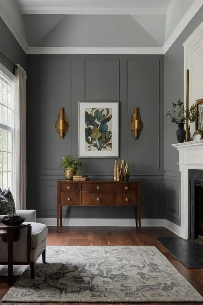
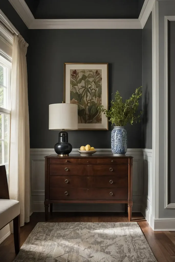
16: Urbane Bronze (Sherwin-Williams)
Transform your space with this rich, earthy dark bronze that creates instant drama and sophistication.
Urbane Bronze adds architectural interest to any room, especially when used on an accent wall or in a small space like a powder room. The warm undertones create a cozy embrace.
This bold neutral pairs beautifully with natural materials and brighter accents.
Use it in spaces where you want to create a cocoon-like atmosphere or highlight a specific architectural feature.
17: Gray Owl (Benjamin Moore)
Choose this chameleon-like light gray for its remarkable adaptability to different lighting conditions.
Gray Owl creates a sophisticated backdrop that enhances architectural details while providing enough color to add interest to your walls. The subtle green undertones add complexity.
This versatile color shifts throughout the day with changing light.
Use it in living rooms, hallways, and bedrooms for a refined neutral that complements both warm and cool accent colors.
18: Balboa Mist (Benjamin Moore)
Transform your home with this delicate greige that creates a soft, atmospheric quality.
Balboa Mist appears more gray in northern light and more beige in warm southern light, creating subtle variation throughout your home.
This adaptability makes it perfect for whole-house use.
The color provides enough depth to create interest without overwhelming your space.
Use it in bedrooms and living areas where you want a calming neutral that still has character.
19: Snowbound (Sherwin-Williams)
Brighten your home with this crisp, clean white that creates a fresh, contemporary atmosphere.
Snowbound offers enough warmth to prevent it from feeling stark while maintaining a modern appearance. The subtle gray undertones add sophistication.
This versatile color works beautifully on walls, trim, and cabinetry.
Use it throughout your home for a cohesive look that brightens your space while maintaining a soft, sophisticated quality.
20: Edgecomb Gray (Benjamin Moore)
Create a welcoming atmosphere with this sophisticated light greige that bridges the gap between beige and gray.
Edgecomb Gray offers enough warmth to feel inviting without the yellow undertones that can make some beiges feel dated. The gray influence gives it a contemporary edge.
This versatile color works beautifully in both north and south-facing rooms.
Use it throughout your home for a cohesive look that adapts well to different lighting conditions and decor styles.
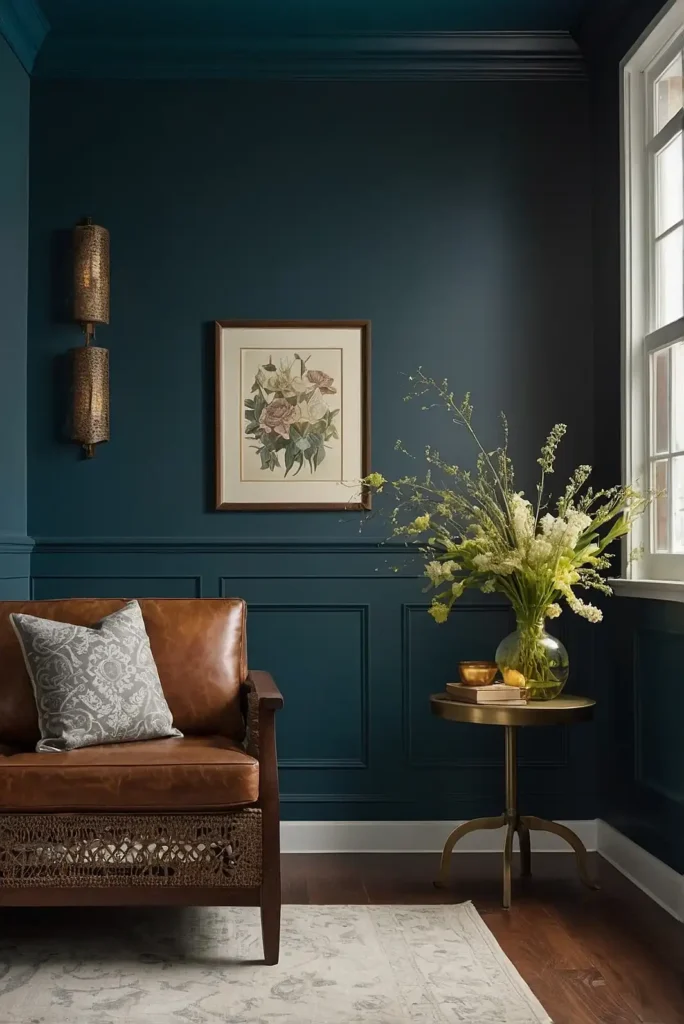
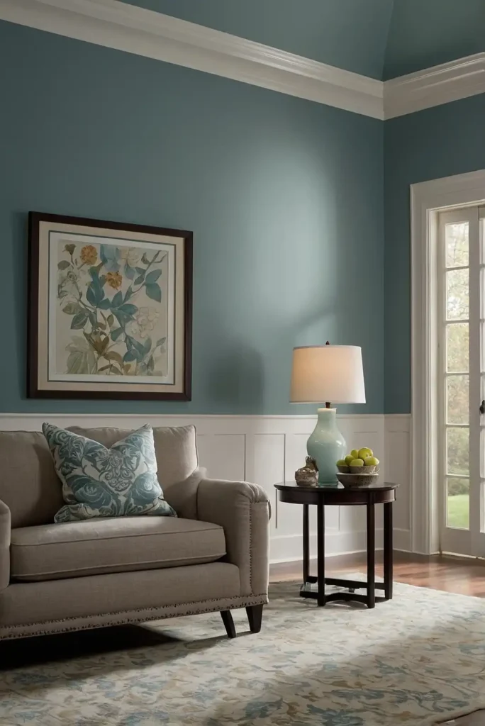
21: Aegean Teal (Benjamin Moore)
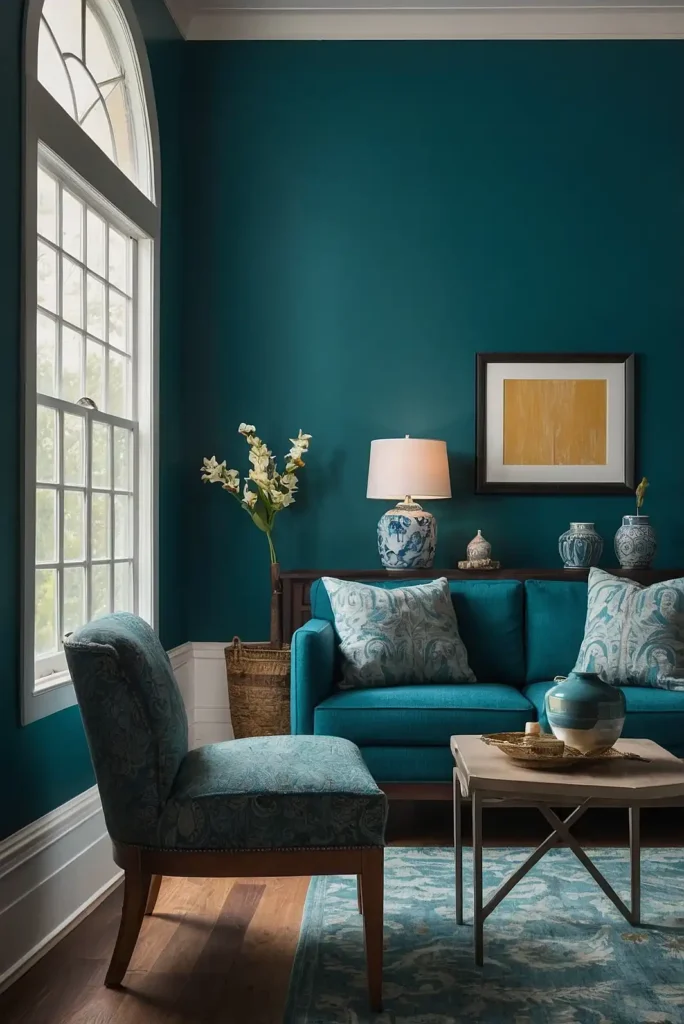
Infuse your space with calming energy using this balanced blue-green that adds character without overwhelming.
Aegean Teal creates a sophisticated backdrop for both modern and traditional furnishings.
The color reads as a neutral with personality rather than a statement color.
This versatile shade works beautifully in kitchens, dining rooms, and bedrooms.
Pair it with warm woods and brass accents for a timeless look that feels both fresh and grounded.
22: Paper White (Benjamin Moore)
Brighten your home with this luminous off-white that offers subtle color without feeling stark.
Paper White creates an airy, expansive feeling while providing more depth than pure white.
The subtle gray undertones add sophistication without feeling cold.
This versatile color works especially well in spaces with limited natural light.
Use it throughout your home for a cohesive look that brightens your space while maintaining visual interest.
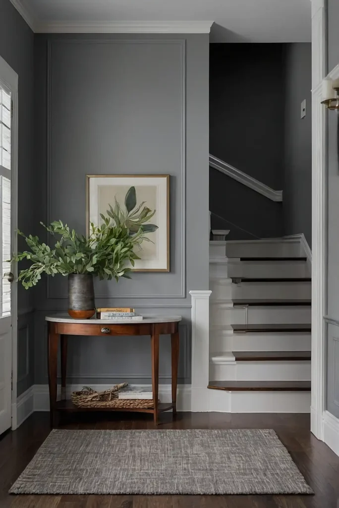
23: Peppercorn (Sherwin-Williams)
Add architectural interest with this rich charcoal gray that creates dramatic sophistication.
Peppercorn offers enough warmth to prevent it from feeling cold or harsh.
The color makes a statement without overwhelming your space, especially when balanced with lighter elements.
This versatile dark neutral works beautifully in dining rooms, home offices, or as an accent wall.
Pair it with crisp white trim and warm metal accents for a balanced, contemporary look.
24: Pale Powder (Farrow & Ball)
Create a serene atmosphere with this delicate blue-green that adds subtle color without overwhelming your space.
Pale Powder offers a sophisticated alternative to beige and gray while maintaining a neutral quality. The color shifts beautifully with changing light.
This versatile shade works especially well in bedrooms and bathrooms.
Pair it with white trim and natural materials for a tranquil, balanced look that never feels too trendy or specific.
25: Worldly Gray (Sherwin-Williams)
Transform your space with this balanced warm gray that bridges the gap between beige and gray.
Worldly Gray creates a sophisticated backdrop that enhances rather than competes with your furnishings. The warm undertones prevent it from feeling cold or sterile.
This versatile color works beautifully in both north and south-facing rooms.
Use it throughout your home for a cohesive look that adapts well to different lighting conditions and decor styles.
26: Chantilly Lace (Benjamin Moore)
Brighten your home with this crisp, clean white that creates a fresh, contemporary atmosphere.
Chantilly Lace offers a true white without noticeable undertones, making it extremely versatile. The color maximizes light reflection without feeling stark or clinical.
This versatile shade works beautifully on walls, trim, and cabinetry.
Use it in spaces where you want a gallery-like backdrop for artwork and colorful furnishings.
27: Salamander (Benjamin Moore)

Create dramatic impact with this deep, rich green that adds instant sophistication.
Salamander offers enough black undertones to function as a neutral while still providing distinctive color.
The richness creates a cozy, embracing atmosphere even in larger spaces.
This bold color works beautifully in dining rooms, libraries, or as an accent wall.
Pair it with lighter neutrals and metallic accents for a balanced look that feels both timeless and on-trend.
Conclusion
The perfect interior paint color creates a foundation for your entire home’s design story.
By selecting versatile, timeless hues that complement your lifestyle and architecture, you’ll create spaces that feel both personal and professionally designed.