27 Stunning Paint Colors to Transform Your Furniture from Drab to Fab
Painting furniture offers one of the most budget-friendly ways to dramatically refresh your home décor.
The right color can transform a forgotten piece into a stunning focal point that elevates your entire space.
Whether you’re refinishing a vintage find or updating tired pieces you already own, choosing the perfect paint color makes all the difference.
Today’s furniture paints offer exceptional durability and finish options.
Ready to breathe new life into your furniture?
Let’s explore 27 incredible paint colors that designers love for furniture makeovers, from timeless classics to bold statement-makers.
1: Classic Navy Blue
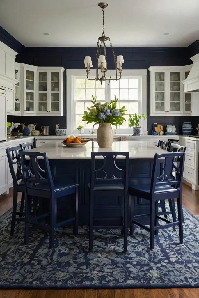
Classic navy blue transforms ordinary furniture into sophisticated statement pieces. This timeless color works in virtually any decorating style, from coastal casual to formal traditional.
Navy provides dramatic impact while functioning as a practical neutral. It hides marks and scuffs better than lighter colors, making it perfect for high-use pieces like kitchen chairs.
Try Benjamin Moore’s “Hale Navy” or Sherwin Williams’ “Naval” for a rich, balanced navy that complements both warm and cool color schemes.
2: Soft Sage Green
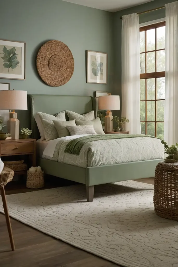
Soft sage green adds natural tranquility to furniture without overwhelming your space. This versatile muted green works beautifully in bedrooms, living areas, and dining spaces.
Sage creates an organic, calming presence while still providing gentle color. It pairs exceptionally well with natural wood tones, brass hardware, and crisp whites.
Consider Magnolia Home’s “Garden Trowel” or Behr’s “Sage Green” for the perfect balance of gray and green undertones.
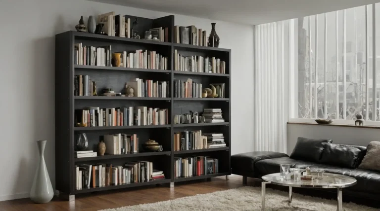
3: Matte Black
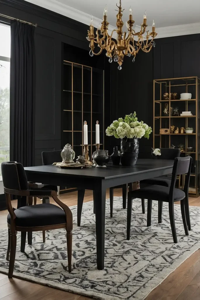
Matte black delivers instant drama and designer impact to furniture pieces of all styles. This bold neutral creates stunning contrast in light-filled spaces.
Black furniture anchors a room while allowing other elements to shine. The matte finish adds sophisticated texture without harsh reflections or fingerprints.
Try Fusion Mineral Paint’s “Coal Black” or Annie Sloan’s “Athenian Black” for a velvety, rich finish that transforms ordinary pieces into showstoppers.
4: Warm White
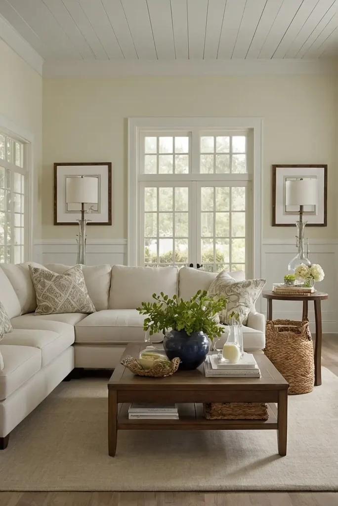
Warm white breathes fresh life into tired furniture while maintaining maximum versatility. This approachable neutral works in any room and complements all decorating styles.
White furniture brightens your space while showcasing interesting silhouettes and details. Choose creamy whites with yellow undertones over stark whites for a more inviting feel.
Consider Benjamin Moore’s “Swiss Coffee” or Sherwin Williams’ “Alabaster” for perfectly balanced warm whites that won’t feel cold or clinical.
5: Dusty Blush Pink
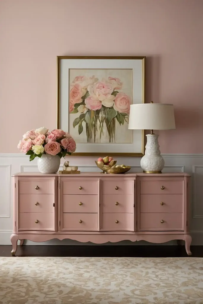
Dusty blush pink introduces subtle color that functions as a sophisticated neutral for furniture. This unexpected hue adds warmth and personality without overwhelming your space.
Blush pink furniture creates a welcoming focal point while complementing a wide range of colors. Pair with brass hardware for an elegant, feminine touch.
Try Sherwin Williams’ “Romance” or Behr’s “Cameo Blush” for the perfect balance of pink and beige undertones.
6: Charcoal Gray
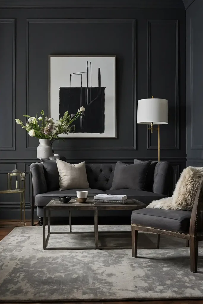
Charcoal gray delivers sophisticated impact with less intensity than black. This versatile neutral works beautifully on everything from accent chairs to bedroom sets.
Gray furniture provides substantial presence while blending harmoniously with most color schemes. The depth of charcoal hides scuffs and wear better than lighter grays.
Consider Benjamin Moore’s “Wrought Iron” or Farrow & Ball’s “Down Pipe” for rich charcoal with perfect balance between warm and cool undertones.
7: Emerald Green

Emerald green creates dramatic, jewel-toned elegance on furniture pieces large and small. This rich color adds luxurious depth and unexpected personality to your space.
Green furniture connects your indoor spaces to nature while making a confident color statement. Emerald works particularly well on accent pieces and dining chairs.
Try Benjamin Moore’s “Hunter Green” or Sherwin Williams’ “Emerald” for a rich green that adds vibrant sophistication.
8: Antique White
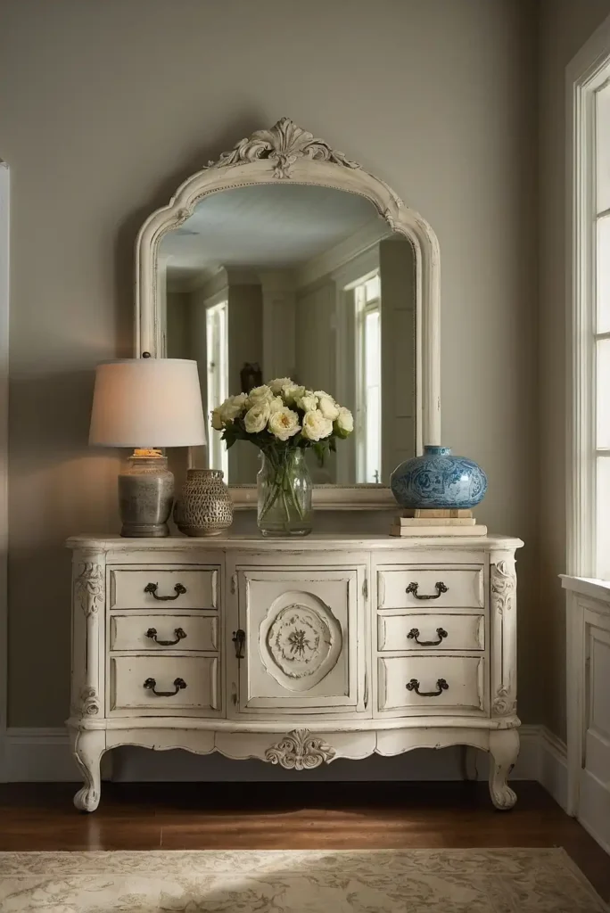
Antique white offers vintage charm and subtle warmth for furniture with traditional character. This creamy off-white creates a timeless, French country aesthetic.
Antique white furniture brightens your space while maintaining an inviting, lived-in quality. It showcases architectural details beautifully without the starkness of pure white.
Consider Annie Sloan’s “Old White” or Rust-Oleum’s “Linen” for the perfect antiqued white finish.
9: Terracotta

Terracotta brings earthy, Mediterranean warmth to furniture while adding rich color. This orange-brown hue adds instant character and old-world charm to basic pieces.
Terracotta furniture creates a welcoming focal point that connects to natural elements in your home. It pairs beautifully with woods, leathers, and natural textiles.
Try Sherwin Williams’ “Copper Mountain” or Magnolia Home’s “Amber” for the perfect balance of orange and brown undertones.
10: French Blue
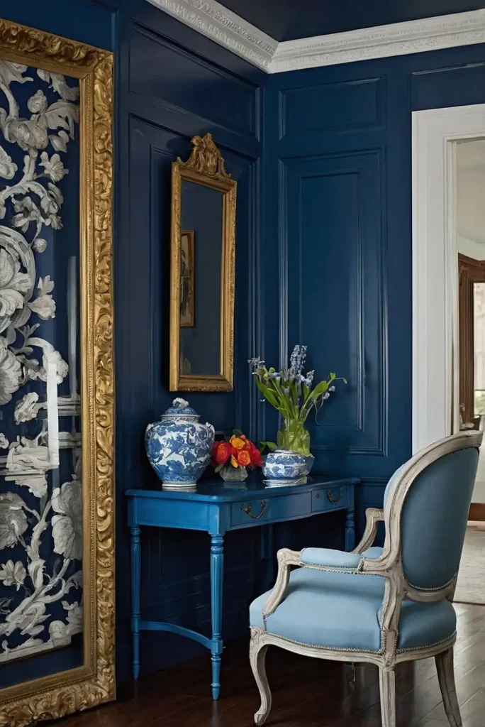
French blue delivers timeless elegance with a perfect balance of vibrancy and sophistication. This medium blue works beautifully on pieces from different eras and styles.
Blue furniture adds refreshing color that still functions as a practical neutral. French blue specifically offers more personality than navy while remaining versatile.
Consider Benjamin Moore’s “Washington Blue” or Annie Sloan’s “Duck Egg Blue” for this perfectly balanced, timeless shade.
11: Greige
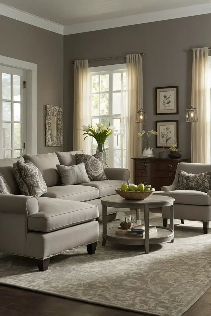
Greige combines the best qualities of gray and beige to create furniture that blends effortlessly into any color scheme. This chameleon-like neutral offers sophistication without coldness.
Greige furniture provides subtle depth while maintaining maximum versatility. It works exceptionally well on larger pieces like dressers and buffets that anchor a room.
Try Sherwin Williams’ “Agreeable Gray” or Behr’s “Perfect Taupe” for the ideal balance between warm and cool undertones.
12: Mustard Yellow
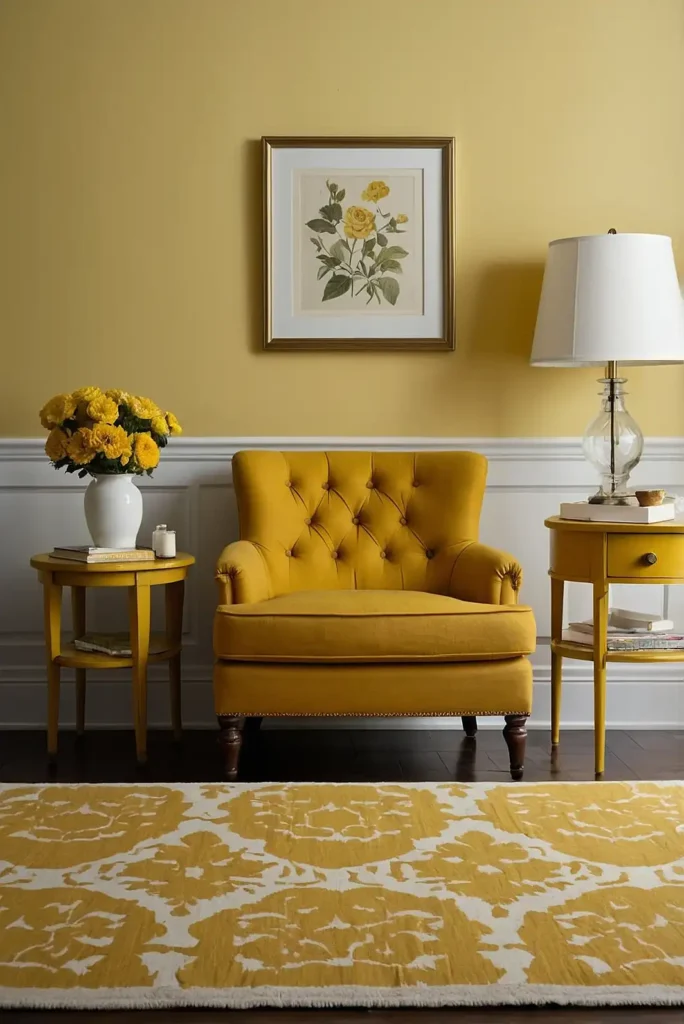
Mustard yellow infuses furniture with bold energy and vintage charm. This warm, golden hue creates instant focal points that brighten your entire space.
Yellow furniture adds cheerful personality while complementing both neutrals and other bold colors. Mustard specifically offers sophistication that brighter yellows lack.
Consider Sherwin Williams’ “Nugget” or Annie Sloan’s “Arles” for the perfect vintage-inspired yellow that avoids looking too childlike.
13: Deep Teal
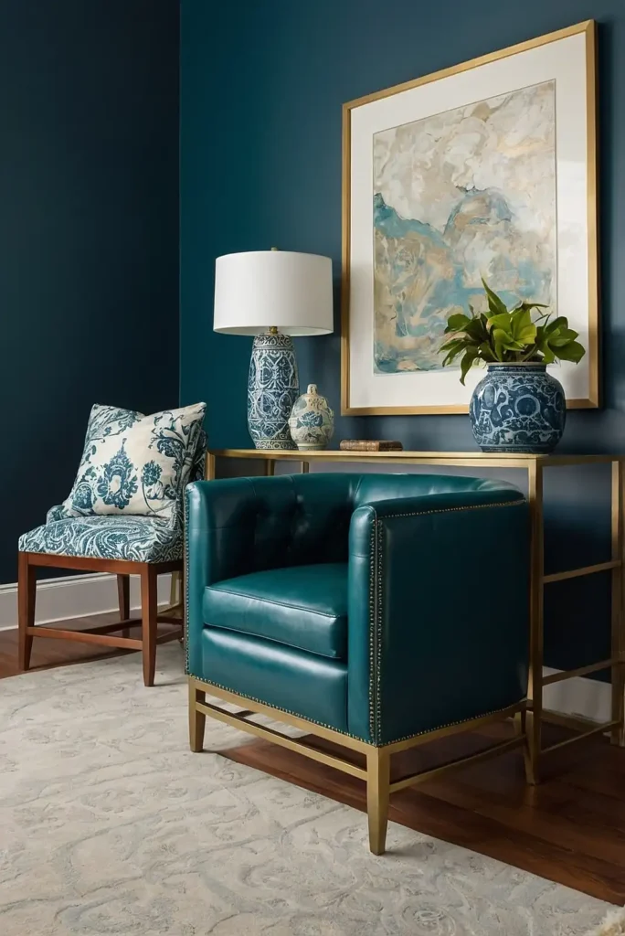
Deep teal delivers rich, jewel-toned elegance to furniture with the perfect balance of blue and green. This sophisticated color creates instant designer appeal.
Teal furniture makes a confident color statement while remaining surprisingly versatile. It pairs beautifully with brass, wood tones, and crisp whites.
Try Benjamin Moore’s “Adriatic Sea” or Sherwin Williams’ “Oceanside” for a perfect teal with depth and richness.
14: Soft Taupe
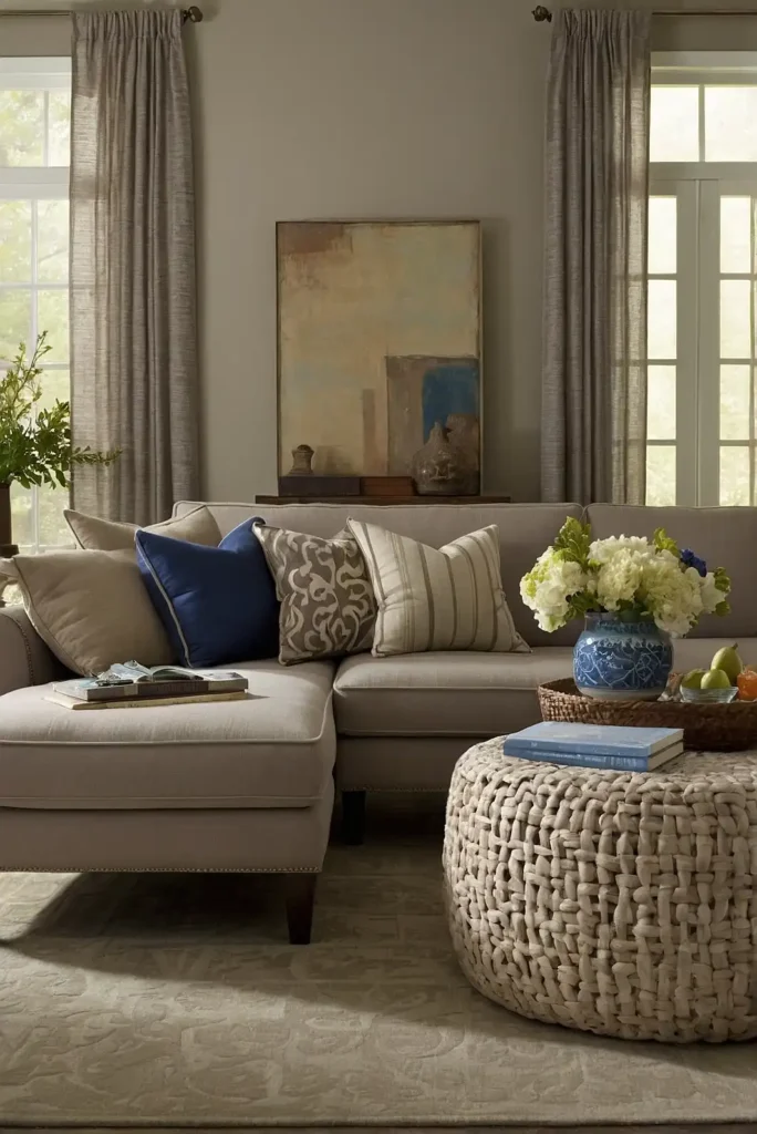
Soft taupe creates subtle sophistication on furniture with its perfect balance of warm and cool undertones. This refined neutral works in any room and decorating style.
Taupe furniture offers more interest than beige while maintaining excellent versatility. It serves as the perfect background for colorful accessories and textiles.
Consider Benjamin Moore’s “Pashmina” or Sherwin Williams’ “Versatile Gray” for a perfectly balanced taupe.
15: Coral

Coral injects energetic warmth and personality into furniture without the intensity of true red. This rosy-orange hue brightens any space with cheerful sophistication.
Coral furniture creates instant focal points that establish a welcoming atmosphere. It pairs beautifully with navy, gray, white, and natural textures.
Try Benjamin Moore’s “Coral Gables” or Sherwin Williams’ “Coral Reef” for the perfect balance of pink and orange undertones.
16: Slate Blue
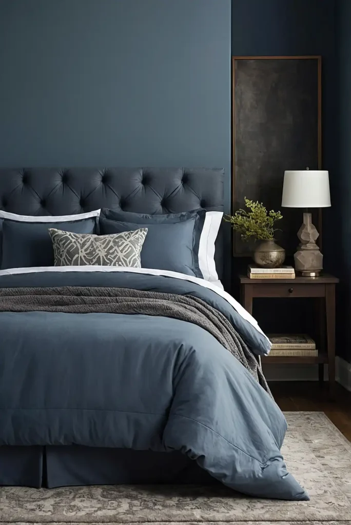
Slate blue delivers sophisticated color with calming gray undertones. This versatile blue-gray works beautifully on furniture in bedrooms, living spaces, and home offices.
Blue-gray furniture provides subtle color that still functions as a practical neutral. Slate specifically offers more depth and presence than lighter blues.
Consider Benjamin Moore’s “Van Deusen Blue” or Sherwin Williams’ “Serious Gray” for a perfectly balanced slate blue with substance.
17: Forest Green
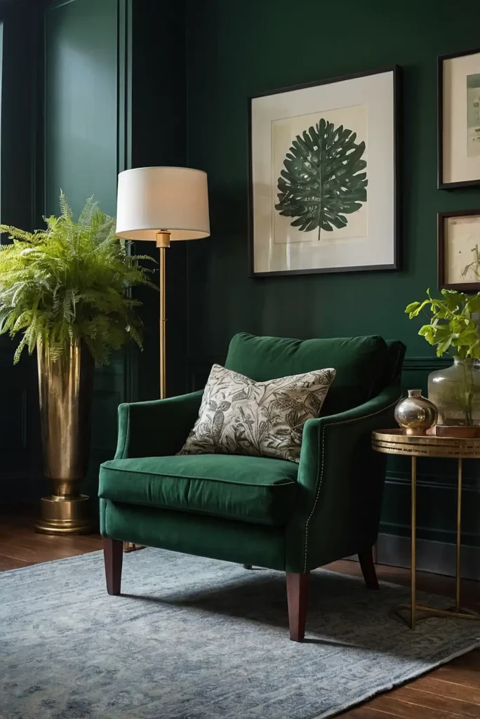
Forest green creates rich, natural elegance on furniture with timeless appeal. This deep green offers dramatic color while connecting to the outdoors.
Green furniture adds life and vitality to neutral spaces. Forest specifically provides sophisticated depth that works year-round, not just seasonally.
Try Farrow & Ball’s “Studio Green” or Sherwin Williams’ “Rookwood Dark Green” for a deep, sophisticated forest tone.
18: Warm Mushroom
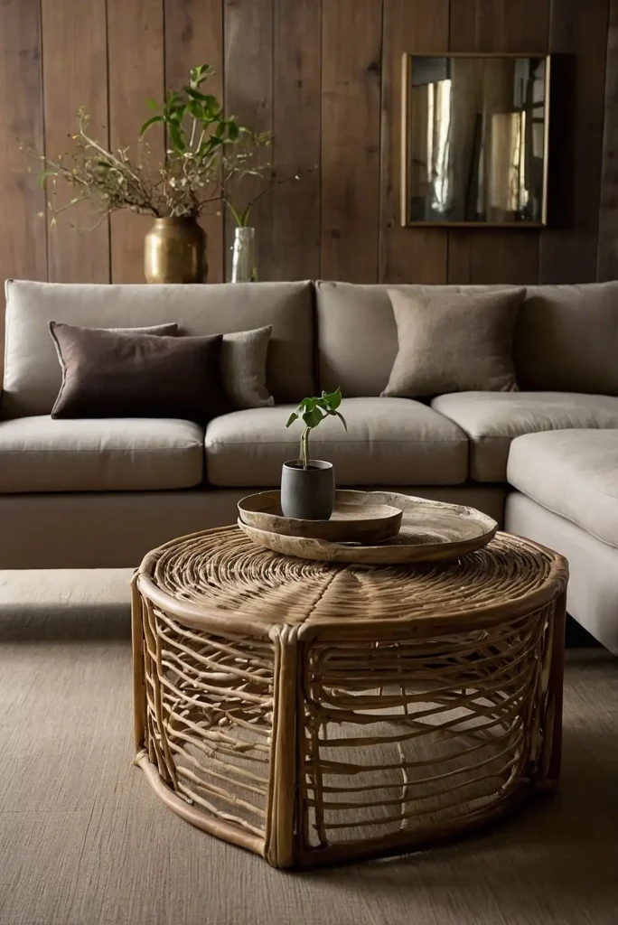
Warm mushroom delivers earthy sophistication to furniture with its perfect balance of gray and brown undertones. This organic neutral functions beautifully in natural, rustic spaces.
Mushroom furniture creates grounding presence while maintaining excellent versatility. It pairs particularly well with natural linens, leathers, and botanical elements.
Consider Benjamin Moore’s “Ashley Gray” or Behr’s “Perfect Taupe” for a warm mushroom with ideal depth.
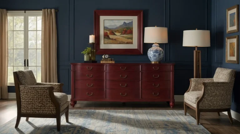
19: Burgundy
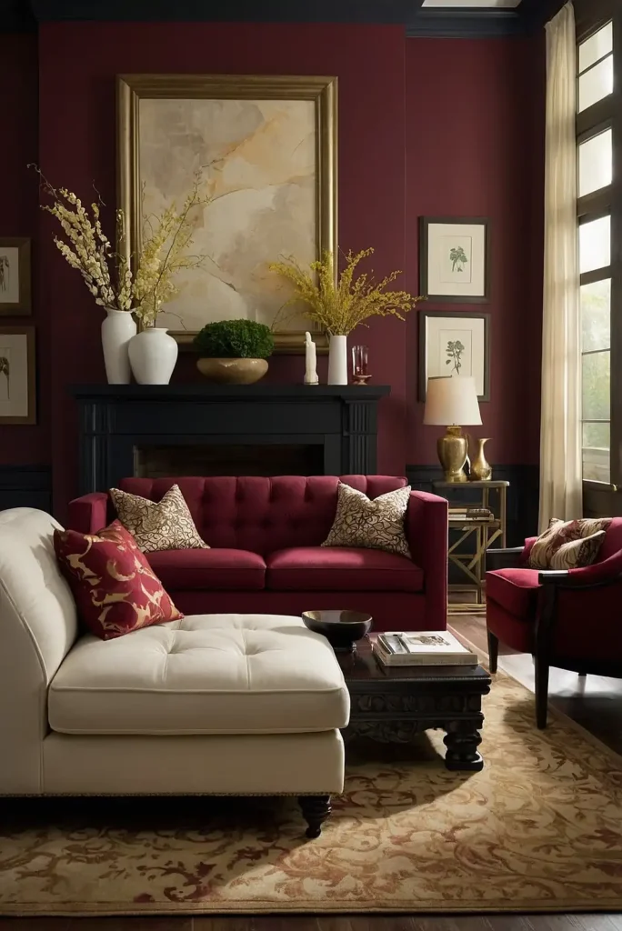
Burgundy transforms furniture with rich, wine-inspired elegance that never goes out of style. This sophisticated red creates dramatic focal points with timeless appeal.
Red furniture makes confident statements while burgundy specifically offers restraint that brighter reds lack. It pairs beautifully with brass, wood tones, and cream textiles.
Try Sherwin Williams’ “Cabernet” or Annie Sloan’s “Burgundy” for the perfect wine-inspired hue.
20: Light Gray-Blue
Light gray-blue creates airy, coastal elegance on furniture pieces large and small. This versatile color adds subtle interest without overwhelming your space.
Blue-gray furniture brightens rooms while providing more character than plain white. It works exceptionally well in bedrooms and living areas for relaxed sophistication.
Consider Benjamin Moore’s “Cloudy Sky” or Sherwin Williams’ “North Star” for the perfect balance of blue and gray undertones.
21: Olive Green
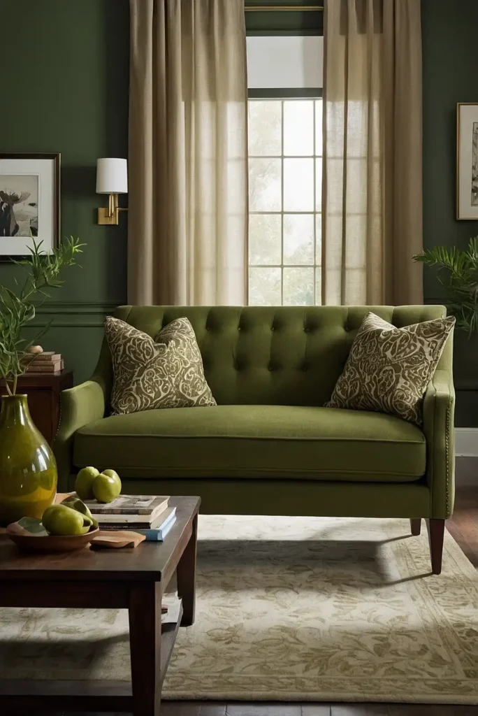
Olive green delivers natural, military-inspired character to furniture with its perfect balance of green and brown. This sophisticated neutral creates instant heritage appeal.
Green furniture connects your space to nature while olive specifically offers vintage sophistication. It pairs beautifully with leather, brass, and rustic woods.
Try Farrow & Ball’s “Calke Green” or Sherwin Williams’ “Relentless Olive” for a perfect, balanced olive tone.
22: Warm Caramel
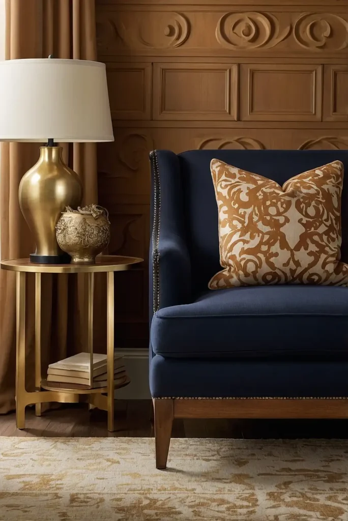
Warm caramel creates rich, amber-inspired elegance on furniture with natural appeal. This golden-brown neutral adds instant warmth to any space.
Caramel furniture provides substantial presence without the darkness of chocolate brown. It pairs beautifully with navy, cream, and natural textures.
Consider Benjamin Moore’s “Decatur Buff” or Sherwin Williams’ “Bagel” for a perfect warm caramel tone.
23: Soft Lavender
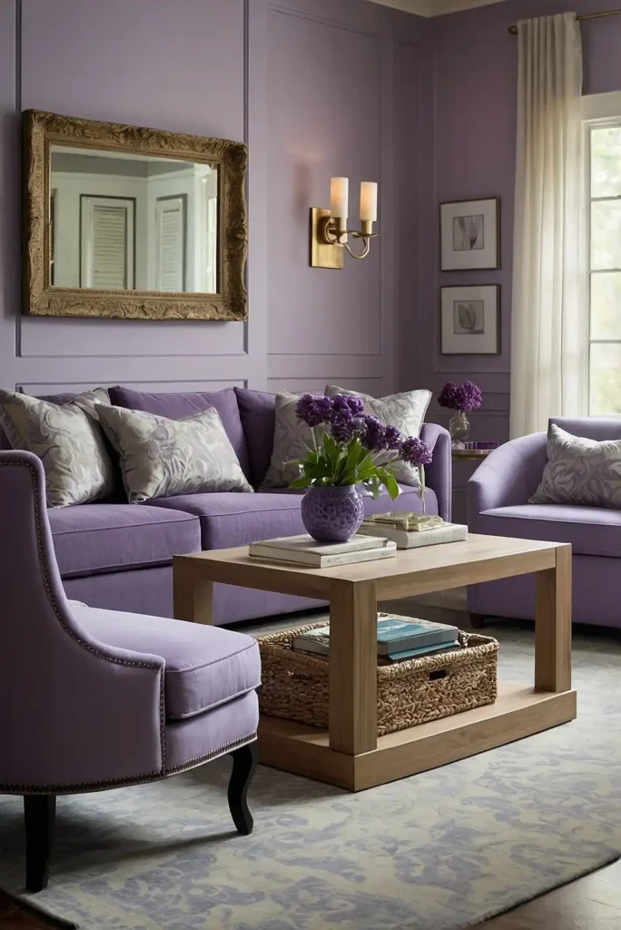
Soft lavender introduces unexpected color to furniture with surprising versatility. This gentle purple creates subtle interest while maintaining sophistication.
Purple furniture adds unique personality while lavender specifically offers restraint and livability. It pairs beautifully with gray, cream, and brass accents.
Try Benjamin Moore’s “Lavender Mist” or Sherwin Williams’ “Awesome Violet” for the perfect balance of purple and gray undertones.
24: Aqua
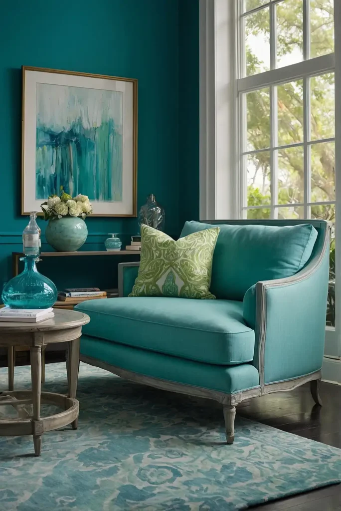
Aqua infuses furniture with refreshing coastal energy that brightens any space. This water-inspired blue-green creates instant cheerful sophistication.
Blue-green furniture adds vibrant personality while functioning as a livable accent color. Aqua specifically connects to water and sky for a naturally uplifting feel.
Consider Benjamin Moore’s “Wythe Blue” or Sherwin Williams’ “Watery” for the perfect balance of blue and green undertones.
25: Soft Black
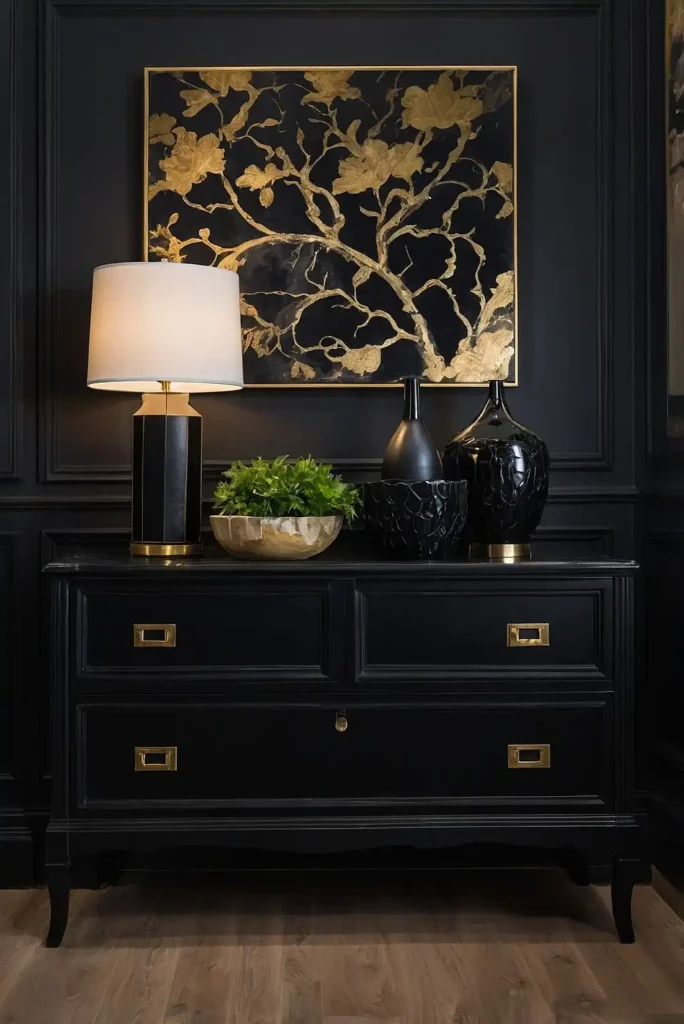
Soft black delivers dramatic impact with slightly less intensity than true black. This near-black with subtle undertones creates sophisticated statement pieces.
Black furniture provides designer-worthy contrast while soft blacks specifically offer a velvet-like depth. They pair beautifully with virtually any color palette.
Try Sherwin Williams’ “Tricorn Black” or Annie Sloan’s “Graphite” for the perfect soft black finish.
26: Peacock Blue
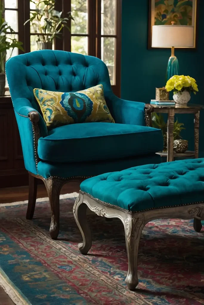
Peacock blue transforms furniture with jewel-toned richness and bold personality. This vibrant blue-green creates statement pieces with designer flair.
Blue-green furniture makes confident color statements while peacock specifically offers maximum impact. It pairs beautifully with gold, white, and deep woods.
Consider Benjamin Moore’s “Galapagos Turquoise” or Sherwin Williams’ “Peacock Plume” for maximum jewel-toned impact.
27: Creamy Linen
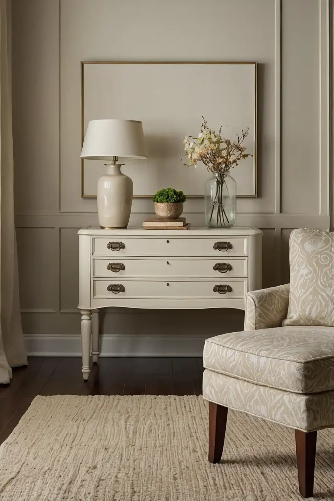
Creamy linen white delivers subtle warmth and texture to furniture with timeless versatility. This warm off-white creates a French linen-inspired finish.
Linen-colored furniture brightens your space while offering more character than stark white. It showcases interesting silhouettes beautifully while hiding minor imperfections.
Try Benjamin Moore’s “White Dove” or Annie Sloan’s “Old White” for the perfect creamy linen finish.
Conclusion
The perfect furniture paint color transforms ordinary pieces into design statements.
Whether you choose timeless neutrals or bold hues, quality paint and proper preparation will ensure your refreshed furniture becomes a lasting favorite.


