
27 Stunning Master Bedroom Paint Colors to Transform Your Sleep Sanctuary
Choosing the perfect paint color for your master bedroom can transform your space from ordinary to extraordinary.
The right shade sets the mood, affects your sleep quality, and creates your personal retreat from the world.
Your bedroom color should reflect your personality while promoting relaxation and comfort. From calming blues to rich, dramatic tones, the possibilities are endless.
Let’s explore 27 stunning paint colors that designers consistently recommend for master bedrooms, helping you find the perfect hue for your sleep sanctuary.
1: Benjamin Moore “Pale Oak”

This sophisticated greige (gray-beige) creates a subtle neutral backdrop that works with virtually any decor style.
The warm undertones prevent the space from feeling cold or clinical.
Pale Oak responds beautifully to changing light throughout the day, appearing slightly warmer in morning light and cooler in the evening.
This versatility makes it a designer favorite for master bedrooms.
2: Sherwin Williams “Sea Salt”

This soothing blue-green-gray chameleon color shifts depending on your lighting and surrounding decor.
In some lights, it appears more green; in others, it leans blue-gray.
Sea Salt creates a spa-like atmosphere that promotes relaxation and sleep.
Pair it with white trim and natural wood tones for a coastal-inspired retreat that never feels themed or overdone.
3: Farrow & Ball “Setting Plaster”

This muted, dusty pink creates the most flattering environment, casting a warm glow that makes everyone look their best.
Despite being pink, it reads almost as a neutral with its subtle terracotta undertones.
Setting Plaster works wonderfully with brass accents, natural linens, and dark woods.
It creates a sophisticated, gender-neutral space that feels both contemporary and timeless.
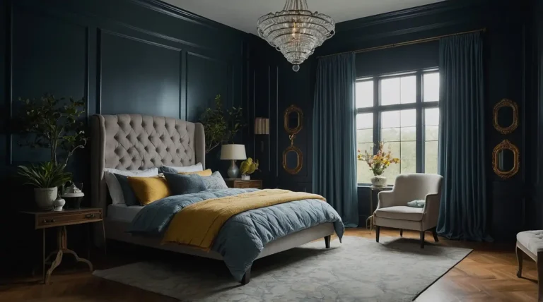
4: Benjamin Moore “Hale Navy”

This classic deep navy blue brings dramatic sophistication to a master bedroom without the heaviness of black.
The rich depth creates instant coziness and intimacy in larger spaces.
Hale Navy pairs beautifully with crisp whites, warm woods, and brass accents. Use it on all four walls for a cocoon-like effect, or on a single accent wall for a less committed approach.
5: Sherwin Williams “Alabaster”

This creamy, soft white provides a clean, bright foundation without the harshness of stark white.
Alabaster carries subtle warm undertones that prevent it from feeling cold or sterile.
This versatile neutral serves as the perfect backdrop for colorful textiles and artwork.
It reflects light beautifully, making smaller master bedrooms appear more spacious and airy.
6: Behr “Blueprint”

This medium-toned blue strikes the perfect balance between vibrant and calming. With gray undertones that keep it sophisticated, Blueprint creates a tranquil atmosphere without feeling too sleepy.
The color complements both warm and cool accents, making it exceptionally versatile. It pairs especially well with natural woods, crisp whites, and subtle metallic finishes.
7: Benjamin Moore “Classic Gray”

This whispery pale gray provides just enough color to create depth while maintaining an airy, open feeling.
Its warm undertones prevent the coolness that makes some grays feel unwelcoming.
Classic Gray changes subtly throughout the day, taking on the characteristics of your natural light. It works beautifully with virtually any accent color or wood tone you introduce.
8: Sherwin Williams “Urbane Bronze”

This rich, deep bronze-gray creates a cocooning effect perfect for master bedrooms.
The earthy depth provides drama without the starkness of black or charcoal, feeling more organic and natural.
Urbane Bronze pairs beautifully with natural linens, creamy whites, and light woods.
The color absorbs light rather than reflects it, creating an intimate, restful atmosphere.
9: Farrow & Ball “Green Smoke”

This sophisticated dark blue-green has a timeless, historic quality that brings instant character to contemporary spaces. The smoky undertones keep it from feeling too bright or juvenile.
Green Smoke creates a moody, enveloping atmosphere perfectly suited for rest and relaxation. It pairs beautifully with antiqued brass, rich woods, and cream-colored textiles.
10: Benjamin Moore “Revere Pewter”

This perfect greige (gray-beige) creates a warm, versatile backdrop that complements virtually any decorating style.
The balance between gray and beige keeps it from feeling too cool or too yellow.
Revere Pewter responds beautifully to changing light throughout the day.
Its chameleon-like quality means your bedroom will feel slightly different—but always welcoming—morning, noon, and night.
11: Sherwin Williams “Repose Gray”

This light warm gray provides subtle color without overwhelming your space.
The slight warmth prevents the clinical feeling that can make pure grays feel unwelcoming in bedrooms.
Repose Gray serves as the perfect neutral canvas for colorful bedding, artwork, and accessories. It pairs equally well with cool blues and greens or warm yellows and terra cottas.
12: Benjamin Moore “Gentleman’s Gray”

Despite its name, this color presents as a sophisticated navy with slight teal undertones.
The depth creates drama without the heaviness of black, perfect for creating a cozy retreat.
Gentleman’s Gray pairs beautifully with brass accents and warm woods. This rich hue feels especially luxurious in rooms with substantial crown molding and architectural details.
13: Sherwin Williams “Agreeable Gray”

This versatile greige adapts to your lighting and decor, working harmoniously with both warm and cool accent colors. Its chameleon-like quality makes it truly “agreeable” with any design style.
Agreeable Gray provides just enough color to prevent your walls from looking stark white, while still reflecting plenty of light. This balance makes it perfect for bedrooms of any size.
14: Benjamin Moore “Edgecomb Gray”

This soft, warm greige creates a subtle backdrop that lets your furnishings and artwork take center stage. The warmth feels welcoming without skewing too yellow or beige.
Edgecomb Gray pairs beautifully with white trim, natural woods, and virtually any accent color. It’s particularly effective in north-facing bedrooms that need warming up.
15: Farrow & Ball “Sulking Room Pink”

This muted rose with significant gray undertones creates a sophisticated, gender-neutral space. Despite being pink, it reads almost as a neutral with its dusty, subdued quality.
Sulking Room Pink casts the most flattering glow on skin tones, making everyone look their best. It pairs beautifully with grays, blacks, and natural woods for a contemporary yet timeless feel.
16: Sherwin Williams “Accessible Beige”

This modern beige with gray undertones avoids the yellow tones that make some beiges feel dated. The result is a warm, versatile neutral that works with virtually any decor style.
Accessible Beige creates a soft, welcoming atmosphere without the starkness of white or the heaviness of deeper colors. It pairs particularly well with white trim and natural wood elements.
17: Benjamin Moore “White Dove”

This soft, warm white provides clean brightness without harsh glare.
The creamy undertones prevent the institutional feeling that can make stark whites feel unwelcoming in bedrooms.
White Dove reflects light beautifully, making smaller bedrooms appear more spacious. It serves as the perfect backdrop for colorful textiles, artwork, and furniture pieces.
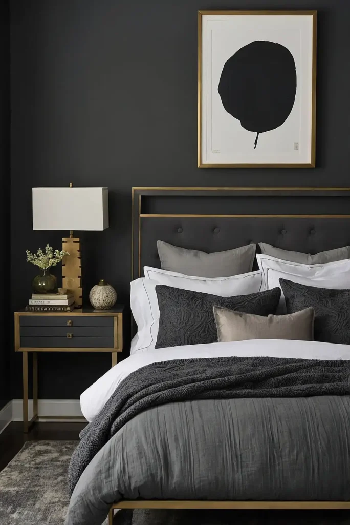
18: Sherwin Williams “Night Owl”

This rich, deep charcoal with subtle brown undertones creates dramatic sophistication without the harshness of pure black.
The depth promotes intimacy and coziness in master bedrooms.
Night Owl pairs beautifully with creamy whites, brass accents, and natural textures.
Consider using it on all four walls for a cocoon-like effect or on a single accent wall for less commitment.
19: Behr “Quiet Time”

This soft blue-gray creates a tranquil atmosphere perfect for restful sleep. The gray undertones keep the blue sophisticated rather than childish, working well in adult retreats.
Quiet Time responds beautifully to different lighting conditions, sometimes appearing more blue, sometimes more gray.
This subtle shifting quality creates visual interest throughout the day.
20: Benjamin Moore “Kendall Charcoal”
This rich, deep gray creates a dramatic backdrop that makes white bedding and light furniture pop.
Despite its depth, it avoids the harshness of black, feeling more organic and sophisticated.
Kendall Charcoal works beautifully as an accent wall behind a headboard or on all four walls for a cocooning effect. It pairs particularly well with brass accents and natural wood elements.
21: Sherwin Williams “Rainwashed”

This soft blue-green-gray creates a tranquil atmosphere reminiscent of spa retreats.
The color shifts subtly throughout the day, sometimes appearing more blue, sometimes more green.
Rainwashed promotes relaxation and restful sleep with its gentle, nature-inspired hue. It pairs beautifully with white, greige, and natural wood tones for a cohesive, peaceful bedroom.
22: Benjamin Moore “Balboa Mist”

This chameleon-like light gray shifts between warm and cool depending on your lighting and surrounding colors.
This adaptability makes it exceptionally versatile for different design styles.
Balboa Mist provides just enough color to prevent walls from looking stark white, while still reflecting plenty of light. This balance makes it perfect for bedrooms of any size.
23: Farrow & Ball “Hague Blue”

This deep, dramatic blue-green with significant black undertones creates a cocooning effect perfect for master bedrooms.
The inky depth feels both historical and thoroughly modern.
Hague Blue absorbs light rather than reflects it, creating an intimate, enveloping atmosphere.
It pairs beautifully with antiqued brass, rich woods, and cream-colored linens.
24: Sherwin Williams “Intellectual Gray”

This medium-toned warm gray provides more depth than lighter grays without the drama of charcoal.
The warmth prevents the clinical feeling that makes some grays feel unwelcoming.
Intellectual Gray serves as a sophisticated neutral backdrop for colorful bedding and artwork. It pairs equally well with warm and cool accent colors, making it exceptionally versatile.
25: Benjamin Moore “Soft Fern”

This muted, grayish green brings the tranquility of nature indoors.
The significant gray undertones keep it sophisticated rather than bright, perfect for creating a serene retreat.
Soft Fern promotes relaxation and connection with nature without overwhelming your space. It pairs beautifully with warm woods, creamy whites, and natural textiles.
26: Sherwin Williams “Dorian Gray”

This medium-depth warm gray provides sophisticated color without overwhelming your space.
The slight warmth prevents the clinical feeling that can make pure grays feel stark.
Dorian Gray works beautifully with both warm and cool accent colors. Its versatility makes it an excellent foundation for seasonal decor changes throughout the year.
27: Benjamin Moore “Caliente”

This vibrant, energizing red creates a passionate atmosphere for couples who want their bedroom to feel romantic and stimulating.
The slight orange undertones keep it from feeling too cool or berry-toned.
Caliente makes a stunning accent wall behind a headboard, paired with neutral walls elsewhere.
Balance its intensity with plenty of white, cream, and natural elements for a sophisticated look.
Conclusion
Your master bedroom deserves a color that promotes both rest and rejuvenation.
Choose one of these 27 designer-approved hues to create your perfect sanctuary, reflecting your personal style while enhancing relaxation.