27 Productivity-Boosting Office Paint Colors to Transform Your Workspace
Selecting the right paint color for your office can significantly impact your focus, creativity, and overall work performance.
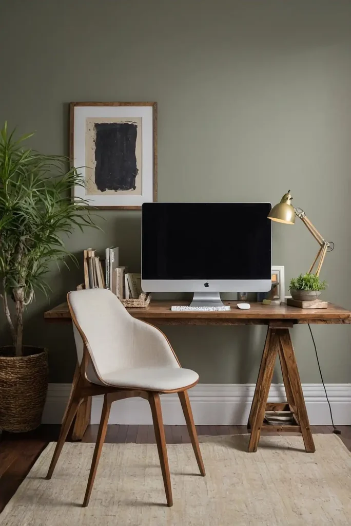
The perfect shade creates an environment that energizes you during morning brainstorming sessions and helps you maintain concentration during afternoon slumps.
Your office color should balance aesthetic appeal with functional benefits.
Whether you’re setting up a corporate space, home office, or creative studio, the right hue can transform your productivity.
Ready to refresh your workspace?
These 27 expertly selected paint colors will help you create the perfect environment for achieving your professional goals, regardless of your work style or industry.
1: Benjamin Moore “Simply White”
This clean, bright white maximizes natural light reflection, creating an expansive, energizing workspace. The subtle warmth prevents the stark, institutional feel that pure whites often create.
Simply White serves as the perfect backdrop for colorful office accessories and artwork. The versatile neutral lets you easily update your space as trends change without repainting.
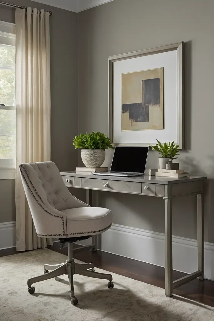
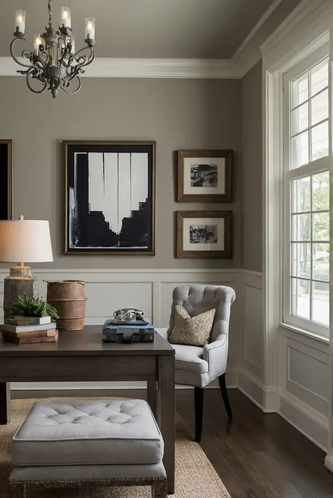
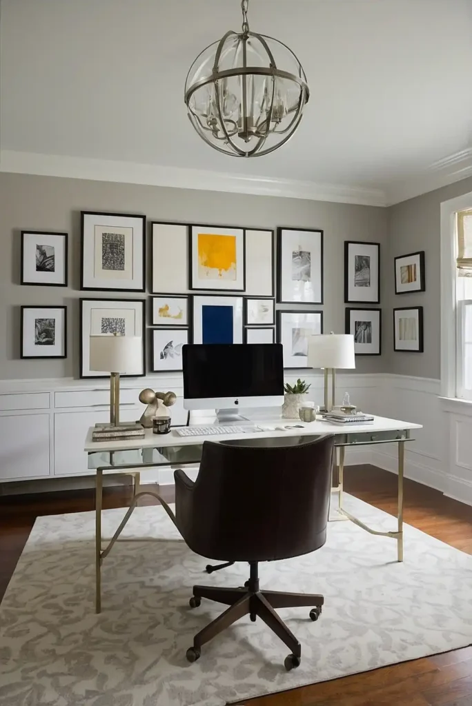
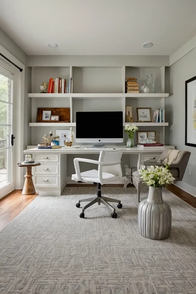
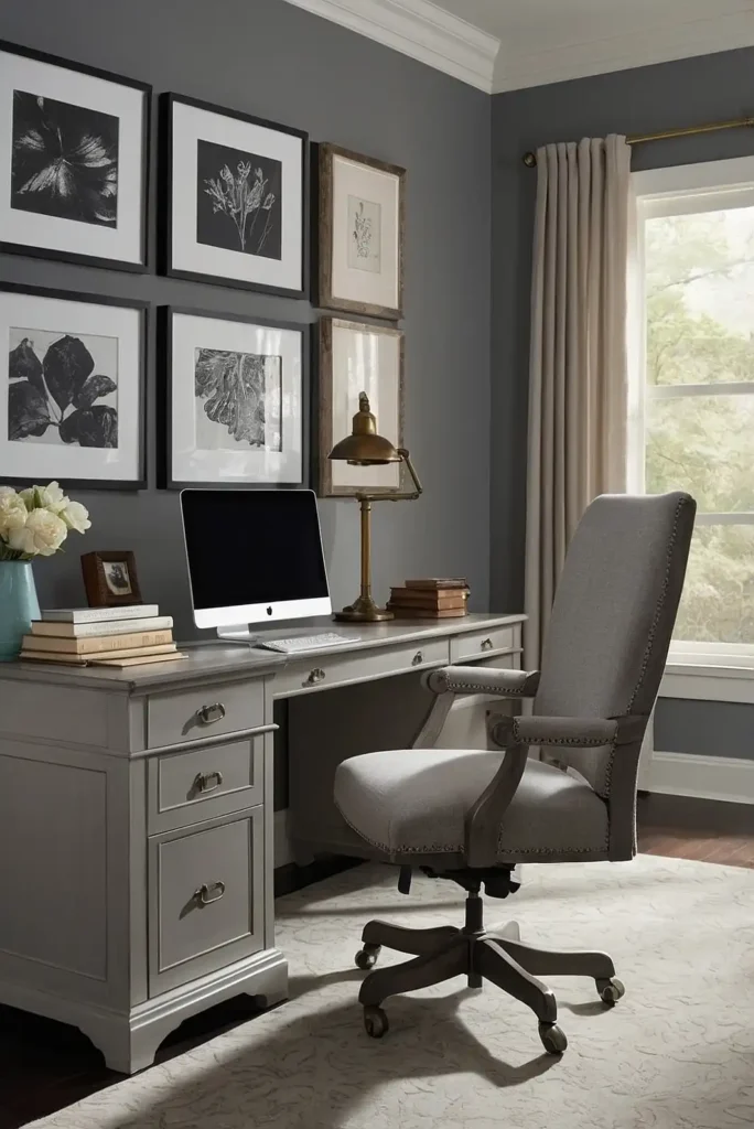
2: Sherwin Williams “Agreeable Gray”
This versatile greige (gray-beige) creates a warm, focused environment without being distracting.
The balanced neutral adapts to your lighting conditions, appearing subtly different throughout the day.
Agreeable Gray pairs beautifully with both warm and cool accent colors.
The sophisticated backdrop works especially well in client-facing offices where a professional yet welcoming atmosphere matters.
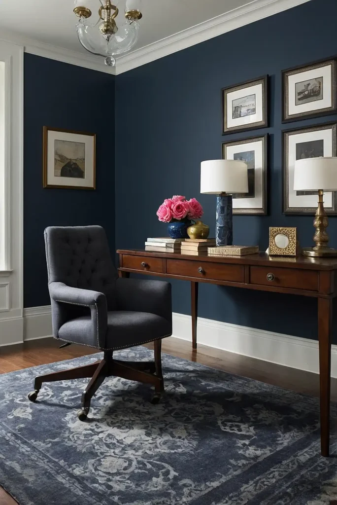
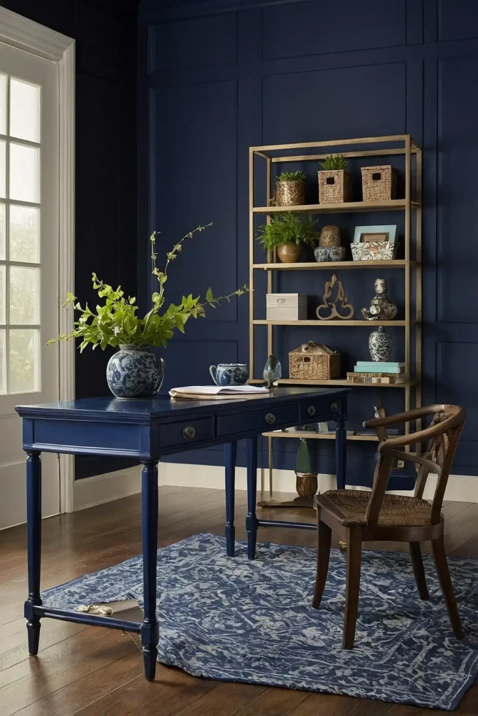
3: Benjamin Moore “Hale Navy”
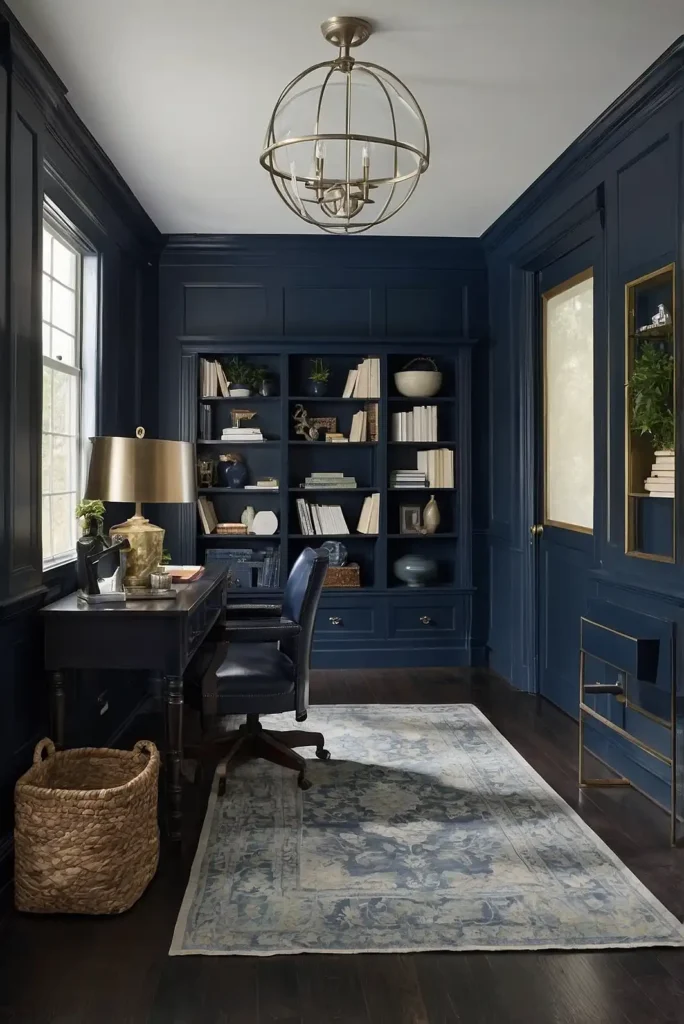
This deep, rich navy creates a sophisticated, focused atmosphere perfect for executive offices or spaces where deep concentration is required.
The traditional hue conveys authority and trustworthiness.
Hale Navy pairs beautifully with brass accents and warm wood tones. Consider using it on a single accent wall to prevent the space from feeling too dark or closed-in.
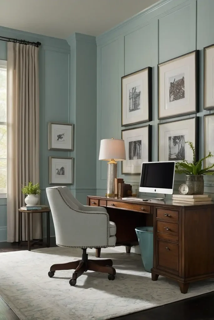
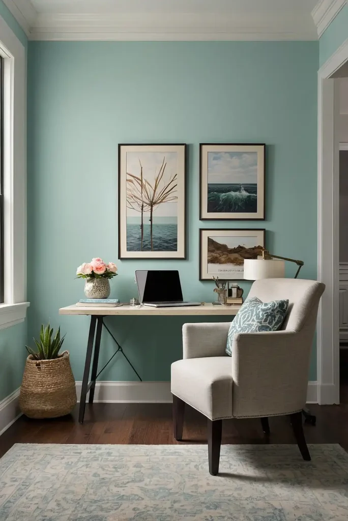
4: Sherwin Williams “Rainwashed”
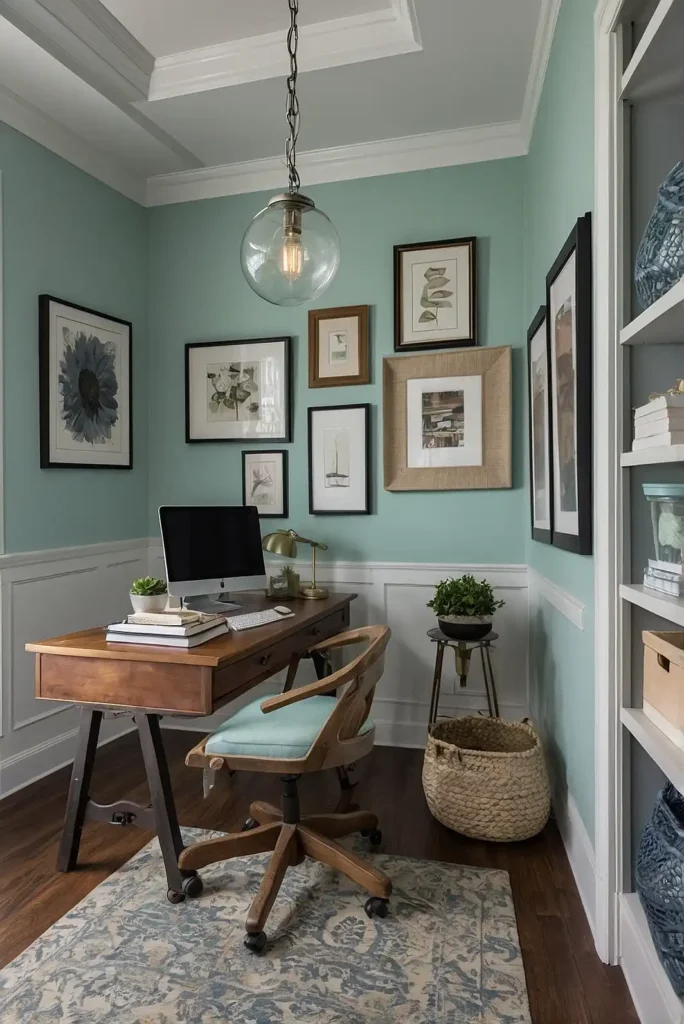
This soft blue-green creates a tranquil, refreshing workspace reminiscent of coastal retreats.
The subtle color reduces stress while providing enough visual interest to stimulate creative thinking.
Rainwashed pairs wonderfully with natural wood and white furniture.
The versatile hue works especially well in offices where you transition between creative tasks and focused work.
5: Benjamin Moore “Pale Oak”
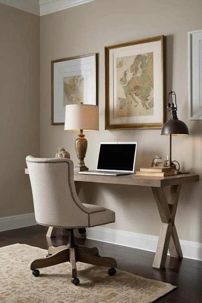
This soft, warm neutral creates a subtle backdrop that promotes focus without distraction.
The light greige tone combines the best aspects of gray and beige for universal appeal.
Pale Oak responds beautifully to changing light throughout the day.
Its chameleon-like quality means your office will feel slightly different—but always welcoming—morning, noon, and night.
6: Behr “Blueprint”
This balanced blue creates a productive, focused environment that helps reduce stress during high-pressure workdays.
The color recalls clear skies, bringing a sense of possibility to your workspace.
Blueprint pairs beautifully with both light and dark wood tones. The versatile hue works especially well in offices that lack natural views, bringing a touch of the outdoors inside.
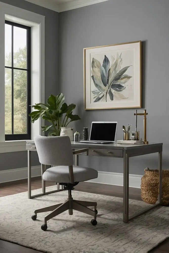
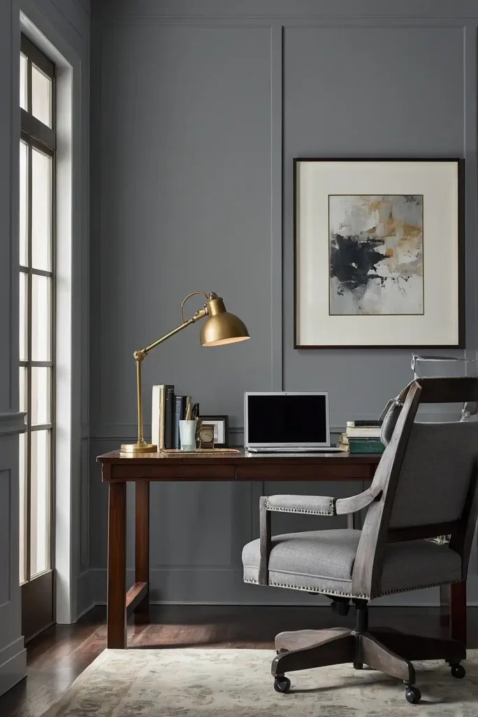
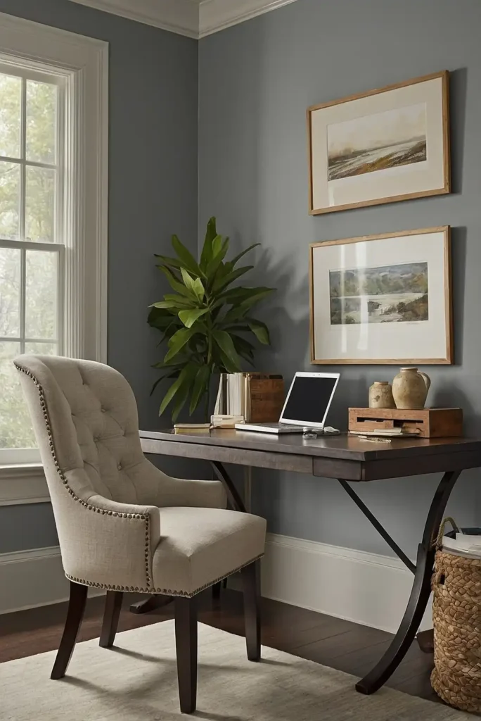
7: Sherwin Williams “Intellectual Gray”
This medium-depth warm gray creates a sophisticated atmosphere that enhances concentration and clear thinking.
The subtle warmth prevents the sterile feeling that can make cooler grays feel unwelcoming.
Intellectual Gray provides the perfect backdrop for artwork and decorative elements.
The neutral tone promotes focus while maintaining a professional, timeless aesthetic in your office.
8: Benjamin Moore “Revere Pewter”
This perfect greige creates a warm, focused environment that works in virtually any office setting.
The balance between gray and beige makes it exceptionally versatile for different work styles.
Revere Pewter pairs beautifully with both traditional and contemporary office furniture.
The neutral backdrop allows your work materials to stand out without competing for attention.
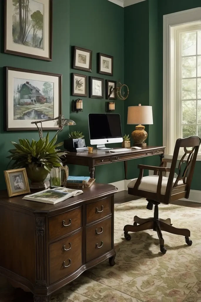
9: Farrow & Ball “Green Smoke”
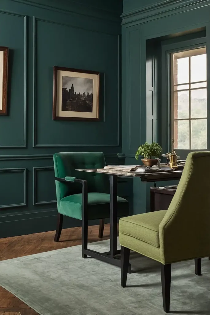
This sophisticated blue-green creates a thoughtful atmosphere perfect for writers, analysts, or anyone requiring deep concentration.
The moody, historic quality brings instant character to contemporary spaces.
Green Smoke pairs wonderfully with antiqued brass and rich wood tones. The color creates a distinguished environment that feels both traditional and thoroughly modern.
10: Sherwin Williams “Repose Gray”
This light warm gray creates a clean, contemporary backdrop that promotes focus without feeling cold or clinical.
The subtle warmth makes your office inviting while maintaining professionalism.
Repose Gray works beautifully with both colorful and monochromatic office decor.
The versatile neutral allows your personality to shine through accessories without becoming the focal point itself.
11: Benjamin Moore “Quiet Moments”
This soft blue-green creates a tranquil atmosphere that helps reduce workplace stress.
The subtle color recalls spa environments, bringing a sense of calm to even high-pressure work settings.
Quiet Moments pairs beautifully with light wood and white furniture.
The soothing hue works especially well in offices where you need to balance creative thinking with detailed analysis.
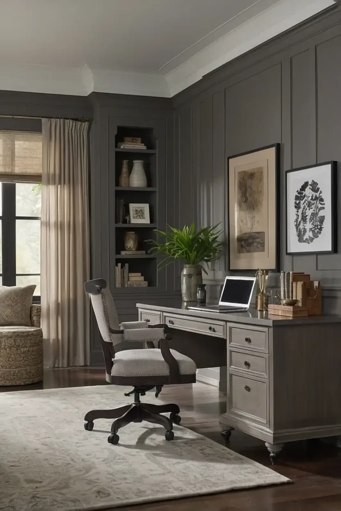
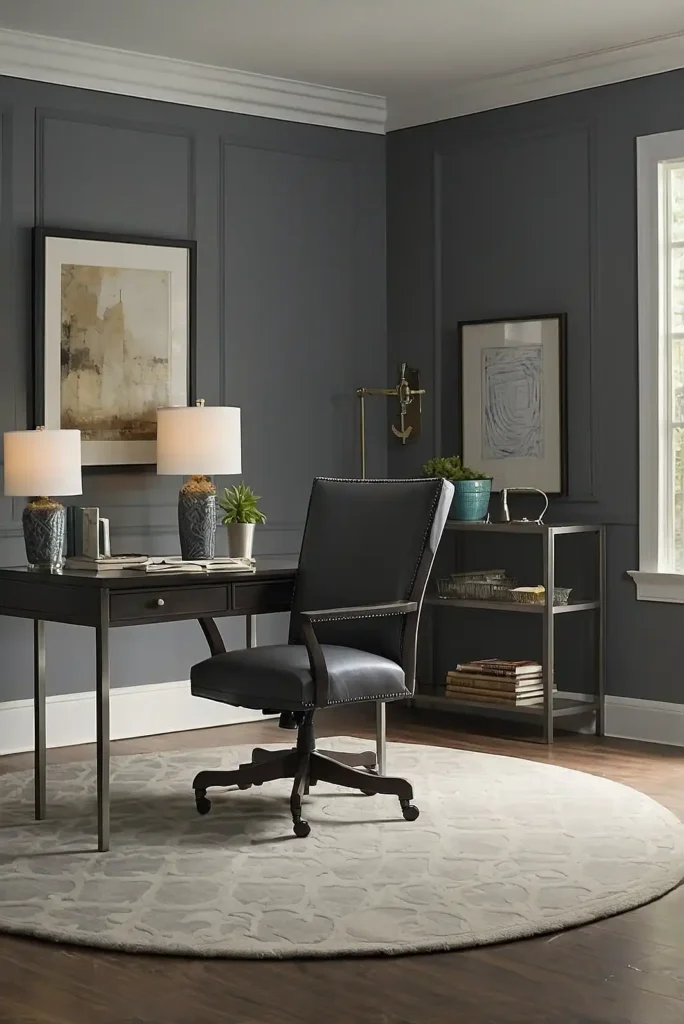
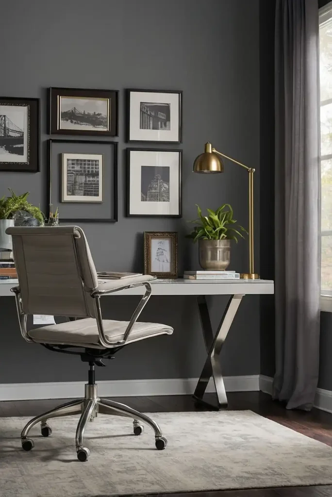
12: Sherwin Williams “Urbane Bronze”
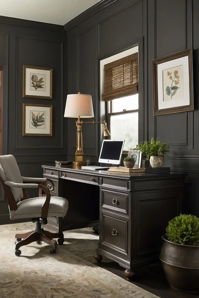
This rich, deep bronze-gray creates a grounding effect perfect for offices requiring focus and authority.
The earthy depth provides sophistication without the starkness of black or charcoal.
Urbane Bronze pairs beautifully with natural linens, creamy whites, and light woods.
Consider using it on a single wall for a dramatic focal point without overwhelming the space.
13: Benjamin Moore “Edgecomb Gray”
This soft, warm greige creates a subtle backdrop that lets your work take center stage.
The warmth feels welcoming without skewing too yellow or beige in different lighting conditions.
Edgecomb Gray pairs beautifully with white trim, natural woods, and virtually any accent color.
It’s particularly effective in north-facing offices that need warming up.
14: Sherwin Williams “Network Gray”
This medium-toned cool gray creates a contemporary, tech-friendly atmosphere perfect for modern workspaces.
The sophisticated neutral promotes clear thinking and focused attention.
Network Gray works beautifully with bright white trim and colorful accents.
The color serves as an excellent backdrop for video conferences, reducing visual distractions in your frame.
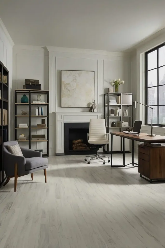
15: Benjamin Moore “White Dove”
This soft, warm white provides a clean brightness without harsh glare, making it perfect for home offices with limited space.
The creamy undertones create a welcoming atmosphere that still feels professional.
White Dove reflects light beautifully, maximizing natural illumination throughout the day.
This quality makes it especially valuable in basement or interior offices with limited windows.
16: Sherwin Williams “Mindful Gray”
This balanced mid-tone gray creates a focused atmosphere that lives up to its name.
The neutral hue promotes clear thinking while providing a sophisticated backdrop for work activities.
Mindful Gray pairs beautifully with both warm and cool accent colors.
The versatile neutral allows you to easily update your office accessories without clashing with your wall color.
17: Benjamin Moore “Stonington Gray”
This classic light gray creates a clean, professional atmosphere with subtle cool undertones. The timeless neutral works in virtually any office setting, from corporate to creative.
Stonington Gray pairs beautifully with white trim and natural wood elements.
The color’s subtle depth prevents the flatness that can make some grays feel industrial or sterile.
18: Behr “Back to Nature”
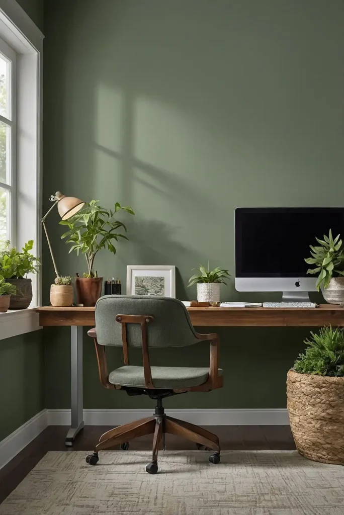
This soft, muted green creates a biophilic connection that reduces stress and enhances creativity. The natural tone brings the restorative effects of the outdoors into your workspace.
Back to Nature pairs wonderfully with natural woods and neutral furnishings. The versatile color works especially well in offices lacking natural views or plant life.
19: Sherwin Williams “Snowbound”
This soft white with subtle warmth creates a clean, bright office environment without the institutional feel of stark whites.
The versatile neutral maximizes light while maintaining a welcoming atmosphere.
Snowbound pairs beautifully with virtually any furniture finish or accent color.
The adaptable backdrop allows your office personality to emerge through furnishings and accessories.
20: Benjamin Moore “Gentleman’s Gray”
This sophisticated navy with slight teal undertones creates a focused, authoritative atmosphere. Despite its name, this color presents as a rich blue-black perfect for accent walls or executive spaces.
Gentleman’s Gray pairs beautifully with brass accents and warm woods. The deep hue feels especially luxurious in offices with substantial architectural details or moldings.
21: Sherwin Williams “Sea Salt”
This chameleon-like blue-green-gray creates a refreshing office environment that shifts subtly throughout the day.
Sometimes appearing more green, sometimes more blue, it creates visual interest without distraction.
Sea Salt pairs beautifully with white trim and natural wood tones. The versatile color works especially well in creative spaces where a balance of focus and inspiration is required.
22: Benjamin Moore “Balboa Mist”
This chameleon-like light gray shifts between warm and cool depending on your lighting and surrounding colors.
This adaptability makes it exceptionally versatile for different office styles.
Balboa Mist provides just enough color to prevent walls from looking stark white, while still reflecting plenty of light.
This balance makes it perfect for both spacious and compact offices.
23: Farrow & Ball “Skimming Stone”
This sophisticated warm neutral creates a subtle backdrop that promotes focused work without distraction.
The versatile tone complements virtually any office furniture style or finish.
Skimming Stone responds beautifully to natural light, creating a slightly different atmosphere throughout the day. This subtle shifting quality prevents visual monotony during long workdays.
24: Sherwin Williams “Colonial Revival Green”
This muted sage green creates a productive, nostalgic atmosphere reminiscent of vintage libraries and traditional workspaces.
The natural hue promotes concentration while connecting with the outdoors.
Colonial Revival Green pairs beautifully with dark woods and brass accents.
The balanced color works equally well in traditional home offices or contemporary workspaces seeking character.
25: Benjamin Moore “Classic Gray”
This whisper-soft pale gray provides just enough color to create depth while maintaining an airy, open feeling.
Its warm undertones prevent the coolness that makes some grays feel unwelcoming.
Classic Gray changes subtly throughout the day, taking on the characteristics of your natural light.
It works beautifully with virtually any accent color or wood tone you introduce.
26: Behr “Whisper White”
This soft, ethereal white creates a clean, distraction-free environment that maximizes productivity.
The subtle warmth prevents the harsh, clinical feeling that pure whites can create.
Whisper White reflects light beautifully, making smaller offices feel more spacious.
The versatile neutral serves as the perfect backdrop for colorful office accessories and artwork.
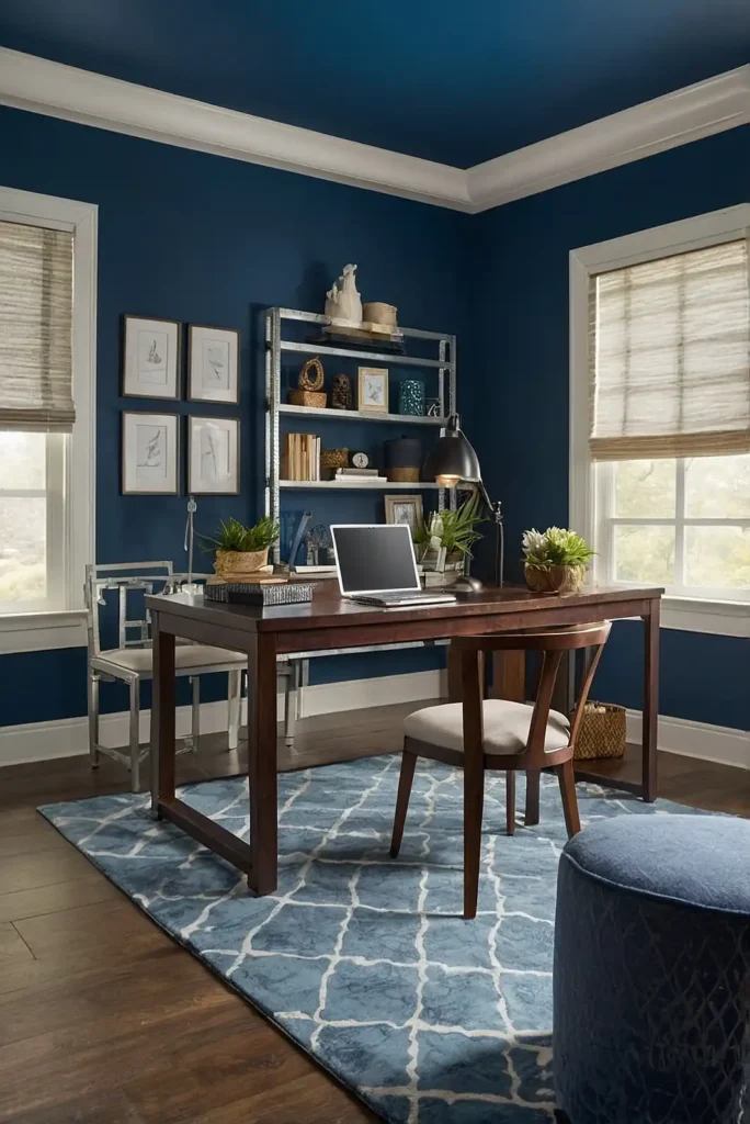
27: Sherwin Williams “Indigo Batik”
This rich, deep blue creates a sophisticated focus zone perfect for deep work and concentration.
The inky depth feels both classic and contemporary, working across various office styles.
Indigo Batik pairs beautifully with light woods and brass accents.
Consider using it on a single accent wall to create a focal point without overwhelming your workspace.
Conclusion
Your office color significantly impacts your workday experience and productivity.
Choose one of these 27 expertly selected hues to create a workspace that not only looks professional but actively supports your unique work style.