
27 Perfect Paint Colors That Make Cherry Cabinets Shine
Cherry cabinets bring timeless warmth and rich character to your kitchen with their distinctive reddish-brown tones.
However, choosing the right wall color to complement these beautiful wood cabinets can feel challenging.
The ideal paint color should balance the cabinet’s natural warmth without competing or clashing with its undertones.
Some shades enhance cherry’s natural richness, while others provide refreshing contrast.
Whether you’re planning a complete kitchen makeover or just refreshing your walls, these paint colors will help you create a cohesive, stylish space that showcases your cherry cabinets at their best.
Let’s explore the perfect hues to make your kitchen shine.
1: Soft Sage Green

Soft sage creates a natural, calming counterbalance to cherry’s warm red undertones.
This earthy green introduces a subtle complementary color relationship that feels fresh without overwhelming.
The muted quality of sage prevents it from competing with your cabinets while still adding character.
Look for sage options with slight gray undertones for the most sophisticated pairing.
This color works particularly well in kitchens with ample natural light, as it softens and shifts beautifully throughout the day.
Try Benjamin Moore’s “Saybrook Sage” or Sherwin Williams’ “Clary Sage.”
2: Creamy Off-White

A warm off-white with subtle yellow undertones creates a classic, timeless backdrop for cherry cabinets.
This neutral option brightens your space while letting the wood’s rich color take center stage.
Avoid stark whites which can create too harsh a contrast. Instead, choose creamier options that harmonize with the warm undertones in your cabinets.
This versatile color works in any lighting situation and pairs beautifully with most countertop materials. Try Sherwin Williams’ “Alabaster” or Benjamin Moore’s “Swiss Coffee.”
3: Warm Beige

A warm, neutral beige creates a seamless transition with cherry cabinets, letting their natural beauty shine.
This harmonious pairing feels cohesive without being predictable or boring.
Choose beiges with subtle yellow or orange undertones to complement the warmth in cherry wood.
Avoid cooler beiges with gray undertones, which can clash with the wood’s warmth.
This combination creates an inviting, timeless kitchen that will never feel dated. Try Benjamin Moore’s “Manchester Tan” or Sherwin Williams’ “Accessible Beige.”
4: Soft Blue-Gray

A muted blue-gray introduces a cool contrast to cherry’s warmth without creating jarring opposition.
This subtle color adds sophistication while maintaining a serene atmosphere.
Look for blue-grays with a touch of green to better harmonize with the wood tones.
This modification helps bridge the warm-cool gap more gracefully.
This pairing works exceptionally well in north-facing kitchens that receive cooler light. Try Benjamin Moore’s “Wedgewood Gray” or Sherwin Williams’ “Upward.”
5: Buttery Yellow

A soft, buttery yellow enhances cherry’s warm glow while adding cheerful energy to your kitchen. This color pairing feels sunny and welcoming without being overpowering.
Choose yellow with beige or cream undertones rather than bright lemon shades. The subtle quality prevents the combination from feeling too intense or dated.
Yellow particularly complements darker cherry finishes by lightening the overall feel of the space. Try Benjamin Moore’s “Philadelphia Cream” or Sherwin Williams’ “Antiquity.”
6: Warm Greige

A perfect blend of gray and beige, warm greige offers sophisticated neutrality that complements cherry cabinets beautifully. This balanced hue feels contemporary yet timeless.
Choose greiges that lean slightly warm rather than cool to maintain harmony with cherry’s undertones. This subtle warmth creates cohesion without being obvious.
This versatile color works in any lighting condition and complements most countertop materials. Try Sherwin Williams’ “Agreeable Gray” or Benjamin Moore’s “Revere Pewter.”
7: Muted Terracotta
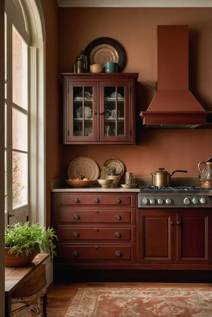
A subtle terracotta creates a Mediterranean-inspired kitchen that enhances cherry’s natural warmth. This earth-toned pairing feels rich and grounded without overwhelming the space.
Choose subdued, dusty terracotta rather than bright orange-reds. The muted quality prevents competition with the cabinets while maintaining a cohesive warmth.
This combination works beautifully in kitchens aiming for rustic elegance or Tuscan-inspired design. Try Benjamin Moore’s “Incense Stick” or Sherwin Williams’ “Terra Cotta.”
8: Soft Taupe

A neutral taupe with warm undertones creates a sophisticated backdrop that complements cherry without competing.
This versatile color enhances the wood’s richness while remaining understated.
Look for taupe shades with slight pink or purple undertones to echo the undertones found in cherry wood. This subtle connection creates visual harmony.
This elegant pairing works particularly well in transitional or contemporary kitchens. Try Benjamin Moore’s “Pale Oak” or Sherwin Williams’ “Agreeable Gray.”
9: Misty Light Blue

A soft, misty blue provides refreshing contrast to cherry’s warmth without feeling stark or cold. This subtle pairing creates a balanced, inviting kitchen with visual interest.
Choose blues with gray undertones rather than bright or primary blues. The subtle haziness helps bridge the gap between warm cabinets and cool walls.
This combination works particularly well in kitchens with bronze or copper accents. Try Benjamin Moore’s “Breath of Fresh Air” or Sherwin Williams’ “Rainwashed.”
10: Warm Olive Green

A muted olive green creates a nature-inspired pairing that enhances cherry’s organic quality. This earthy combination feels grounded and timeless with subtle sophistication.
Choose olive tones with brown undertones rather than yellower versions. This subtle brownish quality helps create harmony with the red-brown of the cherry.
This pairing works beautifully in both traditional and transitional kitchen styles. Try Benjamin Moore’s “Trailing Vines” or Sherwin Williams’ “Retreat.”
11: Soft Mushroom Gray

A warm mushroom gray with subtle purple undertones creates an unexpected yet harmonious backdrop for cherry cabinets. This sophisticated neutral enhances the wood’s richness.
Choose mushroom shades with warm undertones rather than cool grays. This warmth creates a bridge between the cool gray and warm cherry for visual cohesion.
This elegant combination works particularly well in kitchens with marble or quartz countertops. Try Benjamin Moore’s “Wish” or Sherwin Williams’ “Amazing Gray.”
12: Pale Wheat

A soft wheat color with golden undertones enhances cherry’s natural glow while brightening your kitchen space. This warm neutral creates a welcoming atmosphere without overwhelming.
Look for wheat shades with subtle richness rather than flat beiges. This depth complements the natural variations found in cherry wood cabinetry.
This timeless combination works well in kitchens with limited natural light, as it enhances brightness. Try Benjamin Moore’s “Montgomery White” or Sherwin Williams’ “Macadamia.”
13: Muted Navy Blue

A deep navy with gray undertones creates dramatic contrast with cherry cabinets while maintaining sophisticated balance.
This bold pairing feels classic yet fresh and unexpected.
Choose navies with softness rather than bright or primary versions. The subtle muting prevents the contrast from feeling too stark or overwhelming.
This striking combination works particularly well in kitchens with ample space and light. Try Benjamin Moore’s “Hale Navy” or Sherwin Williams’ “Naval.”
14: Silver Sage

A soft silver-sage combines the best qualities of both gray and green for a versatile backdrop to cherry cabinets.
This subtle color adds interest without competing with the wood’s natural beauty.
Choose a version with more gray than green for the most sophisticated pairing.
This balance ensures the color remains neutral enough for long-term enjoyment.
This elegant combination works beautifully in both traditional and contemporary kitchens.
Try Benjamin Moore’s “Gray Cashmere” or Sherwin Williams’ “Sea Salt.”
15: Soft Lavender Gray

A subtle lavender-gray creates an unexpected yet harmonious companion to cherry cabinets.
This sophisticated neutral echoes the sometimes purplish undertones found in cherry wood.
Choose a very subtle, misty version rather than a clearly purple tone. The hint of lavender should be barely perceptible for the most elegant effect.
This unique pairing works particularly well in kitchens with silver or nickel hardware. Try Benjamin Moore’s “Violet Mist” or Sherwin Williams’ “Incredible White.”
16: Balanced Khaki

A warm khaki creates a seamless transition with cherry cabinets for a cohesive, timeless look. This neutral pairing allows the wood’s natural beauty to take center stage.
Choose khaki with warm golden undertones rather than greenish versions. This warmth enhances the rich tones in your cherry cabinetry.
This classic combination works well in traditional and transitional kitchen designs. Try Benjamin Moore’s “Tennesse Ivory” or Sherwin Williams’ “Universal Khaki.”
17: Soft Aqua

A muted aqua introduces refreshing contrast to cherry’s warmth while maintaining a serene atmosphere. This subtle color pairing feels both sophisticated and unexpected.
Choose aqua with gray undertones rather than bright turquoise shades. The subdued quality prevents it from overwhelming the natural wood tones.
This combination works beautifully in kitchens seeking a subtle coastal influence. Try Benjamin Moore’s “Wythe Blue” or Sherwin Williams’ “Watery.”
18: Warm Stone Gray

A warm stone gray creates sophisticated neutrality that lets cherry cabinets shine. This versatile color adds contemporary appeal without feeling cold or stark.
Look for stone grays with warm undertones rather than cool blue-grays. This warmth creates harmony with cherry’s natural reddish tones.
This elegant pairing works well in almost any kitchen style from traditional to modern. Try Benjamin Moore’s “Edgecomb Gray” or Sherwin Williams’ “Balanced Beige.”
19: Muted Gold

A subtle gold with beige undertones enhances cherry’s rich tones while adding warm luminosity to your kitchen. This elegant pairing feels both refined and welcoming.
Choose subdued, antiqued gold rather than bright yellow gold. The muted quality prevents the combination from feeling gaudy or overwhelming.
This rich combination works particularly well in traditional kitchens with classic details. Try Benjamin Moore’s “Richmond Gold” or Sherwin Williams’ “Restrained Gold.”
20: Soft Pewter

A balanced pewter with warm undertones creates sophisticated contrast with cherry cabinets without feeling stark or cold. This versatile neutral adds contemporary appeal.
Choose pewter with subtle warmth rather than cool blue undertones. This warmth helps bridge the gap between the cool gray and warm wood tones.
This elegant combination works beautifully in transitional or contemporary kitchens. Try Benjamin Moore’s “Rockport Gray” or Sherwin Williams’ “Mindful Gray.”
21: Muted Teal

A gray-influenced teal creates a distinctive yet harmonious backdrop for cherry cabinets. This balanced blue-green introduces color while maintaining sophistication.
Choose subdued versions with gray undertones rather than bright teals. The muted quality creates a more timeless, elegant pairing.
This combination works particularly well in kitchens with brass or gold accents. Try Benjamin Moore’s “Aegean Teal” or Sherwin Williams’ “Riverway.”
22: Warm Clay

A soft clay color with pink undertones creates a natural companion to cherry cabinets. This earth-toned pairing feels organic and harmonious without being predictable.
Choose clay shades with subtle warmth rather than strong terracotta. This subtle quality complements cherry’s richness without competition.
This combination works beautifully in kitchens with natural stone or concrete elements. Try Benjamin Moore’s “Pashmina” or Sherwin Williams’ “Camelback.”
23: Pale Celadon

A soft celadon green with gray undertones creates a refreshing yet subtle contrast to cherry’s warmth. This sophisticated pairing feels both timeless and unexpected.
Choose very pale, misty versions rather than clearer greens. The haziness helps this cool color harmonize with the warm wood tones.
This elegant combination works particularly well in kitchens with marble or quartz countertops. Try Benjamin Moore’s “Glass Slipper” or Sherwin Williams’ “Quietude.”
24: Soft Caramel

A gentle caramel tone creates seamless harmony with cherry cabinets for a warm, enveloping kitchen space. This tonal pairing enhances the wood’s natural richness.
hoose soft, muted caramel rather than intense orangey versions. The subtle quality prevents the combination from feeling too heavy or dark.
This rich combination works particularly well in kitchens with limited natural light. Try Benjamin Moore’s “Brookline Beige” or Sherwin Williams’ “Craftsman Brown.”
25: Misty Lavender Blue

A subtle lavender-blue creates an unexpected yet sophisticated backdrop for cherry cabinets. This unique color adds interest while maintaining a serene atmosphere.
Choose very subdued versions where the lavender influence is barely perceptible. The subtle purple undertones actually echo similar undertones sometimes found in cherry.
This distinctive pairing works beautifully in kitchens with silver or chrome accents. Try Benjamin Moore’s “Paper White” or Sherwin Williams’ “Icelandic.”
26: Warm Putty

A neutral putty with yellow undertones creates a versatile backdrop that enhances cherry’s natural glow. This subtle pairing feels both timeless and contemporary.
Choose putty shades with warmth rather than cooler gray versions. This warmth creates harmony with the cabinets while maintaining neutrality.
This adaptable combination works well with virtually any design style or countertop material. Try Benjamin Moore’s “Muslin” or Sherwin Williams’ “Amazing Gray.”
27: Soft Mocha

A light mocha with gray undertones creates sophisticated depth that complements cherry’s rich character. This neutral pairing feels warm without being too heavy.
Choose mocha shades with subtle complexity rather than flat brown. This depth echoes the natural variations found in cherry wood.
This elegant combination works particularly well in traditional or Tuscan-inspired kitchens. Try Benjamin Moore’s “Weimaraner” or Sherwin Williams’ “Mega Greige.”
Conclusion
Whether you prefer subtle harmony or striking contrast, the perfect paint color awaits your cherry cabinets.
Sample your favorites in your actual kitchen lighting before committing to ensure the perfect match for your unique space.