27 Best Paint Colors for Small Kitchens: Transform Your Tiny Space into a Stylish Culinary Haven
Struggling with a cramped kitchen? The right paint color can work wonders in making your small cooking space feel larger, brighter, and more inviting.
Paint offers the most dramatic transformation for the least investment, especially in compact kitchens where every design choice matters.
Ready to maximize your mini kitchen’s potential? Let’s explore the 27 best paint colors that will make your small kitchen look and feel bigger while reflecting your personal style.
1: Crisp White (Benjamin Moore’s “Simply White”)

This timeless classic reflects light beautifully, instantly making your kitchen feel more spacious. Simply White offers a clean canvas that works with any decor style.
It brightens dark corners and creates an airy atmosphere that other colors simply can’t match. Pair with stainless steel appliances for a contemporary look that never goes out of style.
2: Soft Cloud Gray (Sherwin-Williams’ “Repose Gray”)

This versatile light gray creates a sophisticated backdrop without the starkness of pure white. Repose Gray adapts to your lighting conditions, appearing warmer or cooler throughout the day.
It pairs beautifully with both warm and cool accent colors, making it incredibly versatile for your kitchen accessories and decor elements.
3: Pale Sage Green (Behr’s “Sage Wisdom”)

This soothing, nature-inspired hue brings tranquility to your cooking space while maintaining an open feel.
The subtle green undertones create a fresh atmosphere without overwhelming the senses.
Sage works wonderfully with natural wood tones and white cabinetry, creating an organic, harmonious kitchen environment.
4: Sky Blue (Benjamin Moore’s “Breath of Fresh Air”)

This ethereal light blue creates the illusion of bringing the outdoors in, making your kitchen feel less confined.
Its soft, airy quality mimics the open sky, psychologically expanding your space.
This shade pairs beautifully with white cabinets and natural materials, creating a refreshing coastal vibe in even the smallest kitchen.
5: Soft Buttercream (Sherwin-Williams’ “Creamy”)

This warm off-white creates an inviting atmosphere while still reflecting plenty of light.
Unlike stark whites, Creamy offers subtle warmth that makes your kitchen feel simultaneously cozy and spacious.
It complements both modern and traditional cabinet styles, making it extremely versatile for any kitchen aesthetic.
6: Pale Gray-Blue (Benjamin Moore’s “Quiet Moments”)

This tranquil hue sits perfectly between gray and blue, creating a serene backdrop for culinary activities.
The color shifts beautifully throughout the day, appearing more gray or more blue depending on the lighting.
Its versatility makes it compatible with various accent colors and cabinet finishes, allowing for personalization within a space-enhancing palette.
7: Matte Black (Farrow & Ball’s “Pitch Black”)

This bold choice creates dramatic contrast, especially when used on lower cabinets with lighter uppers.
Though counterintuitive, the depth of black can actually create a perception of receding walls.
When balanced with plenty of light elements, black brings sophisticated definition to a small kitchen without making it feel closed in.
8: Soft Greige (Benjamin Moore’s “Revere Pewter”)

This perfect gray-beige hybrid provides warmth without darkness, making your kitchen feel cozy yet open.
Revere Pewter expertly bridges the gap between gray and beige, creating a universally flattering neutral.
It adapts well to different lighting conditions and complements most cabinet colors and countertop materials.
9: Butter Yellow (Sherwin-Williams’ “Butter Up”)

This cheerful hue brings warmth and energy to your kitchen while keeping the space feeling open.
Yellow stimulates appetite and conversation, making it perfect for creating a welcoming kitchen atmosphere.
Keep it in a soft, buttery tone rather than bright sunshine to maintain the spacious feel while adding personality.
10: Pale Blush Pink (Benjamin Moore’s “Pink Bliss”)

This unexpected neutral brings subtle warmth while reflecting light beautifully around your space.
The barely-there pink reads almost as a neutral but adds a touch of personality that plain white lacks.
It pairs wonderfully with gray, white, or wood tones for a contemporary look with character.
11: Light Mint Green (Behr’s “Winterfresh”)

This refreshing pastel creates a clean, invigorating atmosphere in compact cooking spaces.
The cool undertones keep the space feeling open and airy, while the hint of color adds personality.
Mint green pairs particularly well with white countertops and natural wood accents for a fresh, contemporary look.
12: Soft Pewter (Benjamin Moore’s “Stonington Gray”)

This sophisticated mid-tone gray delivers depth without darkness, creating dimension in your small kitchen.
The balanced undertones make it exceptionally versatile with different cabinet finishes and countertops.
Use it as an all-over color or as an accent wall against lighter neutrals to add interest and sophistication.
13: Whispery Lavender (Sherwin-Williams’ “Sensitive Tint”)

This barely-there purple offers unexpected subtlety with its space-enhancing reflective qualities.
So light it almost reads as a white with just a hint of color, Sensitive Tint brings a unique element to your kitchen.
It pairs beautifully with white or gray cabinetry and adds an unexpected twist to your neutral palette.
14: Coastal Blue (Benjamin Moore’s “Glass Slipper”)

This pale, water-inspired blue opens up your kitchen while nodding to relaxed coastal style.
The silvery undertones keep it from feeling too saturated, maintaining that crucial light-reflecting quality.
It brings a vacation-like tranquility to your kitchen while still functioning as a practical everyday color.
15: Creamy Mushroom (Farrow & Ball’s “Skimming Stone”)

This versatile warm neutral adds depth and sophistication without darkening your space.
Skimming Stone sits beautifully between gray, beige, and cream for a complex neutral that’s never flat.
It works with both cool and warm accent colors, making it highly adaptable to changing decor preferences.
16: Pale Aquamarine (Benjamin Moore’s “Healing Aloe”)

This barely-there blue-green creates a spa-like tranquility in busy cooking spaces.
The color is so subtle it almost functions as a neutral, yet provides more interest than plain white.
Healing Aloe pairs beautifully with white cabinetry and creates a fresh, clean atmosphere perfect for kitchens.
17: Soft Coral (Sherwin-Williams’ “Coral Reef”)

This warm, energizing color creates a welcoming atmosphere when used thoughtfully as an accent.
While too bold for all four walls in a small kitchen, Coral Reef makes a stunning statement on a single wall.
Balance it with plenty of white and neutral elements to maintain spaciousness while adding personality.
18: Crisp Seafoam (Benjamin Moore’s “Palladian Blue”)
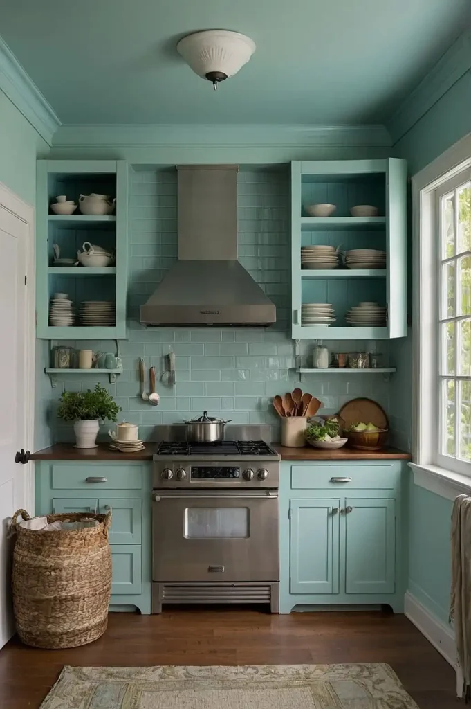
This historic blue-green hue brings timeless character while maintaining an open, airy feel.
Palladian Blue changes beautifully throughout the day, shifting between blue and green depending on the light.
It pairs wonderfully with white trim and cabinetry for a classic look with subtle color interest.
19: Warm Taupe (Sherwin-Williams’ “Accessible Beige”)

This balanced neutral avoids the coldness of gray while staying lighter than traditional beige.
Accessible Beige brings warmth without heaviness, making it perfect for small kitchens needing both coziness and openness.
It complements both warm and cool accent colors, making it exceptionally versatile for changing decor.
20: Pale Celery Green (Benjamin Moore’s “Spring Meadow”)

This fresh, barely-there green brings the outdoors in while maintaining a light, spacious feel. The yellow undertones keep it warm and welcoming rather than cold or clinical.
It creates a garden-fresh atmosphere that makes your kitchen feel connected to nature, even when space is limited.
21: Soft Denim Blue (Sherwin-Williams’ “Mild Blue”)

This approachable medium blue adds character without overwhelming your small kitchen.
When paired with white trim and cabinetry, it creates a pleasing contrast that adds dimension.
Use it on all walls or just as an accent to bring depth and personality to your cooking space.
22: Creamy Bisque (Benjamin Moore’s “Muslin”)

This warm off-white provides subtle depth while maintaining crucial light reflection.
Muslin offers more warmth and character than stark white without veering into too-yellow territory.
It creates a soft, inviting atmosphere that makes your kitchen feel simultaneously spacious and cozy.
23: Muted Teal (Behr’s “Watery”)

This ocean-inspired hue brings tranquil depth while keeping your kitchen feeling open.
The gray undertones keep it sophisticated rather than tropical, making it work in various design styles.
Pair with white cabinetry and natural wood accents for a balanced, harmonious kitchen with personality.
24: Warm Ivory (Sherwin-Williams’ “Alabaster”)

This versatile off-white provides subtle warmth without the yellowish cast of cream.
Alabaster reflects light beautifully while offering more depth and interest than pure white.
It works with virtually any accent color or cabinet finish, making it an excellent foundation for a small kitchen.
25: French Blue (Benjamin Moore’s “Baltimore Sky”)

This classic medium blue brings European charm while still feeling contemporary and fresh.
The slightly grayed undertones keep it sophisticated rather than childlike or overly primary.
Use it as an accent or on all walls for a distinctive kitchen with timeless appeal that still feels open.
26: Soft Olive (Farrow & Ball’s “French Gray”)

This sophisticated green-gray creates a neutral backdrop with organic undertones.
Despite its name, it leans more into the olive family than true gray, bringing nature-inspired warmth.
It pairs beautifully with both light and dark cabinetry, brass fixtures, and natural wood elements.
27: Whispery Peach (Benjamin Moore’s “Soft Peach”)

This gentle, barely-there peach flatters most cabinet finishes while reflecting light beautifully.
Soft Peach creates a subtle warmth that’s more sophisticated than traditional peach tones.
It brings a welcoming glow to your kitchen without dominating the space or making it feel smaller.
Conclusion
The right paint color transforms your small kitchen from cramped to captivating.
Whether you prefer clean whites, soothing blues, or unexpected neutrals, these colors will maximize your space while showcasing your personal style.

