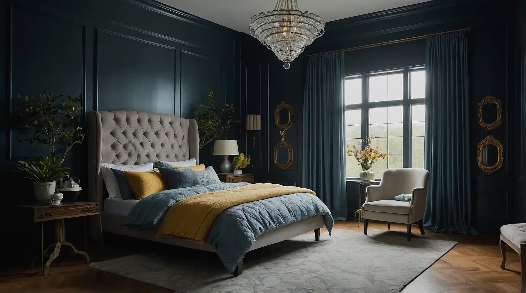
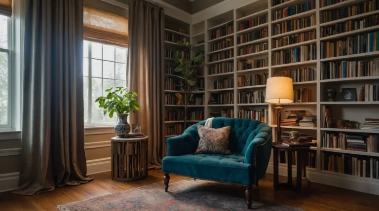
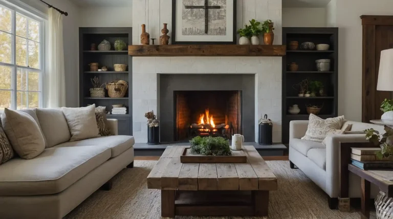
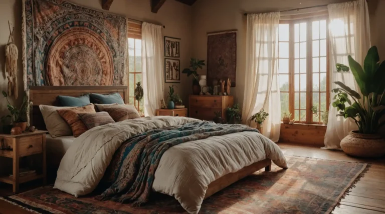
27 Best Paint Colors for Low Light Rooms: Brighten Your Dark Spaces
Struggling with a room that feels like a cave? You’re not alone.
Dark rooms present a unique decorating challenge, but the right paint color can transform these gloomy spaces into warm, inviting retreats.
With strategic color choices, you can reflect the limited light you do have and create the illusion of brightness without relying on major renovations or additional lighting.
Let’s explore 27 paint colors specifically chosen to breathe life into your low-light spaces, making them feel larger, brighter, and more welcoming.
1: Pale Cream (Benjamin Moore Swiss Coffee)

This versatile off-white carries subtle yellow undertones that create warmth without absorbing too much light. Swiss Coffee reflects what little natural light enters your room.
It pairs beautifully with wood tones and works in any space from bedrooms to hallways. The color changes subtly throughout the day, keeping the space interesting.
2: Soft Mint (Sherwin-Williams Mint Condition)

This gentle, refreshing hue brings a hint of nature indoors while reflecting light beautifully. Mint Condition provides enough color to prevent a room from feeling sterile.
It creates a calming atmosphere in bathrooms and bedrooms. The subtle green undertones work particularly well in spaces that face north.
3: Blush Pink (Behr Positively Pink)

This delicate pink acts as a warm neutral that flatters skin tones and creates a welcoming atmosphere.
The rosy undertones reflect light in a way that makes the space feel sunny even on cloudy days.
It pairs wonderfully with gray or navy accents to prevent the room from feeling too juvenile. Blush works beautifully in bedrooms, powder rooms, or dining spaces.
4: Silvery Gray (Benjamin Moore Metropolitan)

This sophisticated true gray lacks the purple or blue undertones that can make a room feel colder. Metropolitan reflects light without creating glare or washout.
It provides an elegant backdrop for artwork and furnishings. The color maintains its integrity even in the evening hours under artificial lighting.
5: Butter Yellow (Sherwin-Williams Butter Up)

This cheerful yellow mimics sunlight, instantly brightening dark corners. Butter Up provides warmth without overwhelming the space like brighter yellows might.
It works wonderfully in kitchens, breakfast nooks, and north-facing rooms. The color pairs beautifully with white trim to maximize the brightening effect.
6: Pale Aqua (Benjamin Moore Crystalline)

This watery blue-green evokes the feeling of natural light reflecting off a clear pool. Crystalline has enough gray in its formula to keep it sophisticated rather than childish.
It creates a serene atmosphere in bedrooms and bathrooms. The color shifts beautifully throughout the day, revealing different aspects of its complex formula.
7: Warm Greige (Sherwin-Williams Agreeable Gray)

This perfect blend of gray and beige offers warmth while maintaining a contemporary feel. Agreeable Gray reflects light excellently without feeling stark like a pure white.
It coordinates with virtually any accent color or wood tone. The versatile shade works in hallways, living rooms, and connecting spaces.
8: Soft Peach (Benjamin Moore Georgia Peach)

This gentle, flattering tone brings warmth while reflecting light beautifully. Georgia Peach creates a subtle glow that mimics the effect of sunset lighting.
It works wonderfully in dining rooms where its flattering tone makes everyone look their best. The color pairs beautifully with cream or white trim.
9: Pale Lavender (Behr Lilac Whisper)

This ethereal purple has enough gray to keep it sophisticated rather than sweet. Lilac Whisper reflects light beautifully while adding unexpected dimension to dark spaces.
It creates a calming atmosphere in bedrooms and reading nooks. The color takes on different characteristics throughout the day, keeping the space interesting.
10: Soft White (Sherwin-Williams Alabaster)

This complex white has warm undertones that prevent it from feeling stark or clinical. Alabaster reflects light exceptionally well without creating harsh glare.
It serves as the perfect backdrop for art and furniture. The versatile shade works in any room of the house where maximum light reflection is needed.
11: Pale Blue-Gray (Benjamin Moore Breath of Fresh Air)

This airy hue mimics the color of a clear sky, bringing the feeling of outdoor openness inside. Breath of Fresh Air reflects light while adding subtle color that shifts throughout the day.
It pairs beautifully with white trim and natural wood accents. The versatile shade works particularly well in bathrooms and bedrooms.
12: Light Sage (Sherwin-Williams Sea Salt)

This chameleon color changes from pale green to soft blue-gray depending on the light. Sea Salt creates a connection to nature even in windowless spaces.
It complements both warm and cool accent colors. The versatile shade works beautifully in bathrooms, bedrooms, and living spaces.
13: Warm Ivory (Benjamin Moore Navajo White)

This classic neutral has yellow-orange undertones that create warmth without becoming too beige. Navajo White mimics the glow of candlelight in dark spaces.
It pairs beautifully with wood tones and traditional furnishings. The versatile color works in hallways, dining rooms, and living spaces.
14: Pale Coral (Behr Flamingo Feather)

This energizing yet sophisticated pink-orange adds life to dark spaces without overwhelming them. Flamingo Feather reflects light while adding a cheerful glow.
It works beautifully in dining rooms, powder rooms, or as an accent wall. The color pairs nicely with navy or charcoal accents for balance.
15: Soft Taupe (Sherwin-Williams Accessible Beige)

This complex neutral balances warm and cool undertones for versatility in any space. Accessible Beige provides depth without absorbing too much light.
It coordinates with both modern and traditional décor styles. The sophisticated color works beautifully in living rooms, hallways, and bedrooms.
16: Pale Celery (Benjamin Moore Spring Meadow)

This fresh, yellow-green adds vibrancy without overwhelming dark spaces. Spring Meadow brings the feeling of nature indoors while reflecting available light.
It pairs wonderfully with white or cream trim. The energizing shade works well in kitchens, breakfast nooks, and home offices.
17: Light Oyster (Sherwin-Williams Eider White)

This complex off-white has subtle gray undertones that add sophistication without darkness. Eider White reflects light beautifully while providing more visual interest than stark white.
It changes subtly throughout the day, revealing different undertones. The versatile shade works in any room requiring brightness without starkness.
18: Soft Apricot (Benjamin Moore August Morning)

This gentle orange-pink mimics the glow of early morning light. August Morning adds warmth and energy to spaces with minimal natural illumination.
It creates a welcoming atmosphere in entryways and living rooms. The color pairs beautifully with cream trim and natural wood accents.
19: Pale Periwinkle (Behr Spacious Skies)

This gentle blue-purple reflects light beautifully while adding unexpected dimension. Spacious Skies creates the illusion of depth without making spaces feel smaller.
It works wonderfully in bedrooms and reading nooks. The color pairs beautifully with crisp white trim to maximize light reflection.
20: Warm Bisque (Sherwin-Williams Creamy)

This rich off-white has yellow undertones that create warmth without becoming too beige. Creamy reflects light exceptionally well while creating a cozy atmosphere.
It provides a perfect backdrop for artwork and furnishings. The versatile color works in any room requiring maximum light reflection with warmth.
21: Soft Silver (Benjamin Moore Silver Satin)

This luminous pale gray has a pearl-like quality that maximizes light reflection. Silver Satin creates a modern, sophisticated backdrop without the starkness of white.
It changes beautifully throughout the day as light conditions shift. The versatile shade works particularly well in hallways and connecting spaces.
22: Pale Gold (Sherwin-Williams Blonde)

This subtle yellow-gold adds warmth without becoming overpowering in dark spaces. Blonde mimics the effect of sunlight streaming into a room.
It creates an inviting atmosphere in living rooms and entryways. The color pairs beautifully with white trim and dark wood accents.
23: Light Celadon (Benjamin Moore Glass Slipper)

This gentle blue-green has gray undertones that keep it sophisticated rather than sweet. Glass Slipper creates a serene atmosphere while reflecting available light.
It works beautifully in bedrooms and bathrooms. The color shifts subtly throughout the day, revealing different aspects of its complex formula.
24: Pale Rose (Sherwin-Williams Romance)

This delicate pink functions as a warm neutral that flatters skin tones. Romance adds subtle warmth without becoming too feminine or childish.
It creates a welcoming glow in bedrooms and sitting areas. The color pairs beautifully with gray or taupe accents for balance.
25: Soft Khaki (Benjamin Moore Revere Pewter)

This perfect greige (gray-beige) provides warmth and sophistication in equal measure. Revere Pewter reflects light well while adding depth to dark spaces.
It coordinates with virtually any accent color or wood tone. The versatile shade works in hallways, living rooms, and connecting spaces.
26: Light Wheat (Sherwin-Williams White Wheat)

This warm neutral has golden undertones that mimic morning sunlight. White Wheat creates a cozy, welcoming atmosphere in dark spaces.
It pairs beautifully with cream trim and natural materials. The versatile color works well in living rooms, dining areas, and bedrooms.
27: Pale Sky Blue (Benjamin Moore Constellation)

This ethereal blue evokes the feeling of open sky, creating visual expansion. Constellation reflects light beautifully while adding subtle color.
It creates a calming atmosphere in bedrooms and bathrooms. The color pairs perfectly with crisp white trim to maximize brightness.
Conclusion
The right paint color transforms your dark room into a bright, welcoming space.
Experiment with samples before committing, as lighting dramatically affects how colors appear in your unique space.

