27 Best Paint Colors for Guest Bedrooms: Create a Welcoming Retreat
Designing the perfect guest bedroom starts with choosing the right paint color.
This crucial decision sets the tone for your visitors’ entire stay and can make even the smallest space feel like a luxury retreat.
With the right hue on your walls, you’ll create an inviting atmosphere that helps your guests feel instantly at home.
The perfect color balances between personal style and universal appeal.
Let’s explore 27 stunning paint colors that will transform your guest room into the most requested accommodation in town!
1: Soft Sage (Benjamin Moore October Mist)
This gentle, muted green creates a nature-inspired sanctuary for your guests. October Mist provides a soothing backdrop that works with nearly any décor style.
The color shifts beautifully throughout the day, revealing different undertones as light changes. Your guests will feel connected to the outdoors while enjoying ultimate comfort.
2: Warm Greige (Sherwin-Williams Agreeable Gray)
This perfect blend of gray and beige creates a sophisticated, neutral backdrop that appeals to everyone. Agreeable Gray provides warmth without committing to a specific color direction.
It pairs beautifully with virtually any accent color or wood tone. Your guests will feel comfortable yet pampered in this versatile, timeless shade.
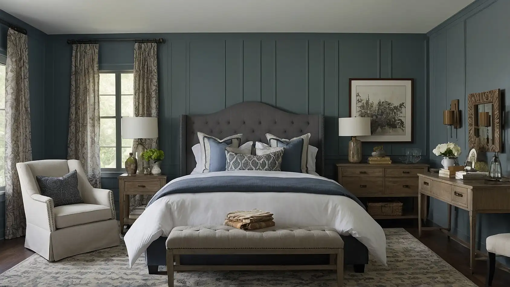
3: Dusty Blue (Benjamin Moore Mount Saint Anne)
This tranquil blue-gray evokes the feeling of clear skies and peaceful mornings. Mount Saint Anne promotes relaxation while adding subtle color interest to your guest space.
It pairs beautifully with crisp white linens and natural wood accents. Your visitors will appreciate this serene, sleep-promoting shade after a long day of travel.
4: Soft White (Sherwin-Williams Alabaster)
This complex off-white has warm undertones that prevent it from feeling stark or clinical. Alabaster creates a clean, fresh feeling that suggests luxury hotel accommodations.
It maximizes light in the room while providing a perfect backdrop for artwork and accent pieces. Your guests will feel the space was designed specifically for their comfort.
5: Pale Lavender (Behr Dreamy Lavender)
This ethereal purple creates a subtle, sleep-promoting atmosphere without feeling too feminine. Dreamy Lavender incorporates enough gray to keep it sophisticated rather than sweet.
It takes on different characteristics throughout the day, showing more blue or pink depending on the light. Your guests will experience improved sleep quality in this tranquil shade.
6: Warm Taupe (Benjamin Moore Pale Oak)
This nuanced neutral has subtle warm undertones that create an instantly welcoming atmosphere. Pale Oak provides enough color to prevent walls from feeling stark.
It complements nearly any décor style from traditional to modern. Your guests will feel embraced by this sophisticated, versatile background color.
7: Soft Aqua (Sherwin-Williams Rainwashed)
This refreshing blue-green evokes coastal retreats and spa getaways. Rainwashed creates a vacation-like atmosphere that helps your guests decompress instantly.
It pairs beautifully with crisp white trim and natural textures. Your visitors will feel like they’ve escaped to a beachside retreat in this tranquil, rejuvenating color.
8: Light Mushroom (Benjamin Moore Edgecomb Gray)
This complex neutral balances warm and cool undertones for ultimate versatility. Edgecomb Gray provides subtle color without overwhelming the space or your guests’ senses.
It creates a sophisticated backdrop that lets artwork and accent pieces shine. Your visitors will appreciate this understated, elegant choice that feels both current and timeless.
9: Pale Blush (Sherwin-Williams Romance)
This delicate pink functions as a warm neutral that flatters all skin tones. Romance creates a subtle glow that makes everyone look their best.
It pairs beautifully with gold accents and crisp white linens. Your guests will feel pampered in this sophisticated, unexpectedly versatile shade.
10: Muted Navy (Benjamin Moore Hale Navy)
This sophisticated dark blue creates a cocooning effect perfect for promoting deep sleep. Hale Navy provides dramatic impact while maintaining a classic, timeless feel.
It pairs beautifully with brass accents and crisp white trim. Your guests will feel they’ve checked into a boutique hotel with this elegant, sleep-promoting color.
11: Soft Wheat (Sherwin-Williams Accessible Beige)
This warm neutral has subtle golden undertones that create an instantly welcoming atmosphere. Accessible Beige provides enough depth to prevent walls from feeling plain.
It works beautifully with both cool and warm accent colors. Your visitors will feel at ease in this versatile, timeless shade that flatters any décor style.
12: Pale Sky (Benjamin Moore Breath of Fresh Air)
This ethereal blue mimics clear morning skies, creating a refreshing atmosphere. Breath of Fresh Air promotes relaxation while maintaining a light, airy feeling.
It changes beautifully throughout the day, shifting from blue to gray as light conditions change. Your guests will feel renewed in this tranquil, uplifting color.
13: Warm Gray (Sherwin-Williams Repose Gray)
This versatile neutral provides sophistication without feeling cold or impersonal. Repose Gray balances perfectly between warm and cool undertones for universal appeal.
It creates a perfect backdrop for artwork and decorative elements. Your visitors will appreciate this elegant, contemporary choice that works with any décor style.
14: Soft Celery (Benjamin Moore Fernwood Green)
This gentle yellow-green creates a nature-inspired retreat that promotes relaxation. Fernwood Green connects your guests to the outdoors even in an urban setting.
It pairs beautifully with natural wood tones and crisp white linens. Your visitors will feel rejuvenated in this fresh, subtle green that avoids trendy territory.
15: Pale Terracotta (Sherwin-Williams Redend Point)
This earthy pink-beige creates a warm, embracing atmosphere reminiscent of Mediterranean getaways. Redend Point provides unexpected character while maintaining universal appeal.
It glows beautifully in both natural and artificial light. Your guests will feel transported to a luxury desert resort in this sophisticated, earthy neutral.
16: Soft Chambray (Benjamin Moore Van Deusen Blue)
This classic medium blue evokes the comfort of well-worn denim. Van Deusen Blue creates a soothing atmosphere without feeling overwhelming or too dark.
It pairs beautifully with brass accents and warm wood tones. Your visitors will enjoy this timeless color that promotes relaxation and restful sleep.
17: Warm Cream (Sherwin-Williams Greek Villa)
This rich off-white has yellow undertones that create a subtle glow in any light. Greek Villa provides a perfect backdrop for other design elements while feeling warm and inviting.
It maximizes light reflection while avoiding stark whiteness. Your guests will feel welcomed by this versatile neutral that suggests luxury hotel accommodations.
18: Pale Mint (Benjamin Moore Hollingsworth Green)
This refreshing yet subtle green creates a spa-like atmosphere of calm and renewal. Hollingsworth Green incorporates enough gray to keep it sophisticated rather than childish.
It pairs beautifully with both modern and traditional furnishings. Your visitors will feel instantly relaxed in this rejuvenating, sleep-promoting shade.
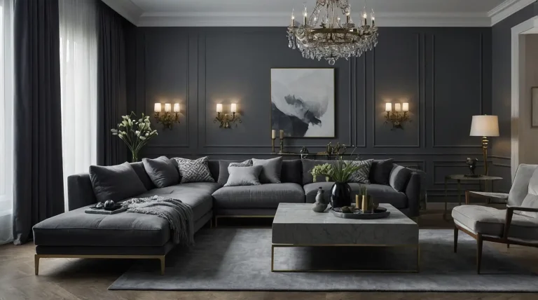
19: Soft Charcoal (Sherwin-Williams Dovetail)
This complex mid-tone gray creates a cocooning effect perfect for promoting restful sleep. Dovetail provides sophisticated drama without the heaviness of black.
It showcases artwork and accent colors beautifully. Your guests will feel they’ve checked into a boutique hotel with this elegant, contemporary shade.
20: Light Caramel (Benjamin Moore Manchester Tan)
This warm neutral has golden undertones that create an instantly welcoming atmosphere. Manchester Tan provides enough depth to prevent walls from feeling plain.
It works beautifully in rooms with limited natural light. Your visitors will feel embraced by this versatile, timeless shade that flatters any décor style.
21: Pale Periwinkle (Sherwin-Williams Windy Blue)
This gentle blue-purple creates a tranquil atmosphere perfect for unwinding after travel. Windy Blue promotes relaxation while adding subtle color interest.
It shifts beautifully throughout the day, revealing different aspects of its complex formula. Your guests will appreciate this serene, sleep-promoting shade.
22: Soft Olive (Benjamin Moore October Mist)
This muted green-gray creates a nature-inspired sanctuary that promotes relaxation. October Mist connects your guests to the outdoors while maintaining sophisticated appeal.
It pairs beautifully with both cool and warm accent colors. Your visitors will feel rejuvenated in this fresh, subtle green that avoids trendy territory.
23: Warm Stone (Sherwin-Williams Mega Greige)
This rich neutral balances warm and cool undertones for ultimate versatility. Mega Greige provides enough depth to create interest without overwhelming the space.
It works beautifully with both traditional and contemporary furnishings. Your guests will feel comfortable in this sophisticated, grounding shade.
24: Pale Blue-Gray (Benjamin Moore Wickham Gray)
This versatile neutral has subtle blue undertones that create a cool, fresh feeling. Wickham Gray provides enough color to prevent walls from feeling stark.
It maximizes light while avoiding the clinical feel of pure white. Your visitors will appreciate this clean, crisp backdrop that suggests luxury accommodations.
25: Soft Khaki (Sherwin-Williams Colonial Revival Stone)
This complex neutral has subtle green undertones that create a connection to nature. Colonial Revival Stone provides sophistication without committing to a specific color direction.
It pairs beautifully with both cool and warm accent colors. Your guests will feel at ease in this versatile, timeless shade that flatters any décor style.
26: Muted Teal (Benjamin Moore Aegean Teal)
This sophisticated blue-green creates a rejuvenating atmosphere reminiscent of coastal getaways. Aegean Teal provides unexpected character while maintaining broad appeal.
It glows beautifully in both natural and artificial light. Your visitors will feel transported to a luxury seaside resort in this complex, soothing color.
27: Pale Mauve (Sherwin-Williams Respite)
This subtle purple-gray creates a tranquil atmosphere perfect for unwinding after travel. Respite promotes relaxation while avoiding overtly feminine associations.
It changes beautifully throughout the day, revealing different aspects of its complex formula. Your guests will experience improved sleep quality in this serene, sophisticated shade.
Conclusion
Choose a color that balances personal style with universal appeal.
Test samples in your specific lighting before committing, as colors appear differently depending on light exposure and room orientation.